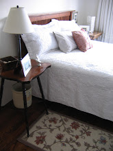
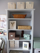
Inspiration rooms on my way to finding a "perfect" neutral wall colour:


After months of serious deliberation, I’ve finally decided on a paint colour for our main floor. And I better be sure because we have painters arriving on Monday! It might seem like I'm playing it safe because I've chosen a milky beige called Soft Chamois OC-13 from Benjamin Moore. But it was an all-consuming internal debate and the choice was anything but obvious!
I've been on the fence about a colour for our main floor. We live in a 35-year old four-level split where the main floor living and dining rooms are one continuous space, together with the kitchen (which is all cupboards and has almost no wall space). Because of the layout, the front foyer and two stairwells (to the upstairs bedrooms and downstairs rooms) would look best painted the same colour (instead of having an ugly and obvious colour change on a corner). The upstairs and downstairs hallways would ideally be the same colour too!
In other words, I needed to find The Perfect Colour. In the beginning, I was insanely smitten with a heavenly stormy blue from Farrow & Ball called Skylight. This is a next-to-perfect blue in my opinion, but blue just won’t cut it.
First of all, it’s a huge space to paint blue and I'm afraid I’ll tire of it. I love blue, but do I want a whole blue house, considering that my office is already blue, we have a blue-grey powder room and various green rooms already?
*
And our living room furniture is sage green, so the blue wasn't an obvious complement. The dining room rug is rose (which looks gorgeous with blue!), and our living room rug is a multi-colored blend of cream and sage and rose and blue (which looked good too). But as much as I coaxed myself to think it might work, the reality was that blue walls introduce yet another pure colour to an already cacophonous mix of shades. Besides, our dining room chairs have blue and pink stripes, the kitchen counters are olive green, a downstairs floor is brown, and the kitchen valance is burgundy! I want tranquility, not chaos!
So I started to think about green. I really wanted a “colour” on the walls, if you know what I mean, since I love the way white lampshades and table linens and white accessories look against a coloured wall. Plus, I love white
things. The walls are currently a chartreuse (yellowish) green that isn't so bad, but each alternative green I considered seemed wrong. Pale sages work the best, and look lovely, but the fact is, I'm no longer crazy about my sage green furniture, and the room is
sage overload with both furniture and walls in the same colour!
So I settled on a
neutral palette. It feels like a cop-out going neutral, especially since it felt that with all my decorating knowledge acquired over the past year, I should be able to pull off a complex palette. But the truth is, I want a calm and collected palette. And a pale, creamy colour seems like the only choice to pull the disparate elements together.
In the past weeks, I’ve painted endless sheets of Bristol board with various Farrow & Ball and Benjamin Moore shades. I've taped these samples to the walls, moved them countless times as the light changed, and stared at them each for hours on end, trying to find the colour equivalent to *Mr.Right*. In fact, I think finding a man is much, much easier than choosing paint colours!

Since greys are all the rage, I looked at a number of grey and greige shades, but they all seemed rather cold to me, even in my south-facing room. So I kept coming back to the warm pale beiges, especially in the evenings when the light fades and the greys become rather dismal and chilly.
*
My final choices came down to (1) Farrow & Ball’s Slipper Satin, a creamy pale beige that seems to glow (2) Benjamin Moore’s White Down CC-50 (an antique white/ivory which I have in my bedroom and adore), (3) Benjamin Moore’s Seapearl OC-19 (a grey-toned oyster beige, pale), and (4) Benjamin Moore’s Soft Chamois OC-13 (a pale milky beige with warm-tones).
Then yesterday, I decided (or so I thought). I chose the Farrow & Ball Slipper Satin and excitedly checked with my painting contractor to see if he minded using it. He was amenable to the idea, so I phoned our (only) local F&B supplier to see if they had enough product on hand. To my dismay, they only had 2 gallons in store ($69.50 per gallon, FYI) and I’d have to wait a couple of weeks until the next shipment arrived!!
*
Since I’m going on vacation in 3 weeks, already have painters booked, and find myself utterly fed up with paint chips, I decided to switch to Benjamin Moore's Soft Chamois just to get this over with! Soft Chamois OC-13 is a nice, soft, quiet beige that I can best describe as “milky beige”. It will look lovely with the sage furniture, the olive countertops, and our dark wood furniture. It'll work especially well with both rugs, which was my main concern since they add the most colour to the rooms.
*
Just for information, I noticed that the actual Soft Chamois paint (from the sample pot) seems darker on the wall than on the paint chip, whereas the White Down I used in my bedroom is much whiter on the wall than on the chip (where it's rather beigey). So I really hope the colour works out once it's on all the walls because these sample chips seem so unreliable with darker colours looking lighter on the chip and vice versa!
*
I feel like the consummate bore doing a beige room - but being unable to start from scratch and having to tie everything together – gave me little choice in the end. Eventually we want to replace the furniture with something more elegant and lighter coloured (like the sofa below) and then I can consider changing to my coveted blue walls! But until then, this is my transition colour to make sense of all the bits we’ve already got.

This summer I intend to replace the drapes in the living and dining rooms (I have some favorite sample fabrics, in linen) and eventually I'll replace my student-days coffee table with something more elegant. I have a cool grey leather armchair that needs re-upholstering and another I want to slipcover, but those are
eventually. For now, getting these walls painted thrills me!
Once the painting is done next week, I'll post some before and after photos to show the progress...
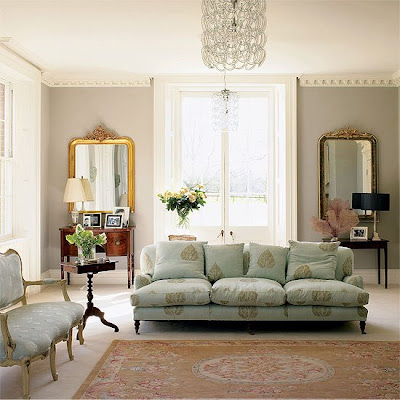
More inspirational neutral rooms:

 All Photos House to Home


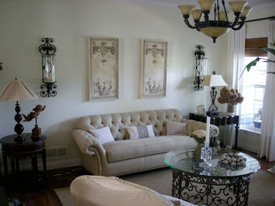
 Besides the coffee table, Maryanne made lots of changes to this gorgeous room and it was fun to study the photos to find them all. She now has a heavenly, delicate chandelier replacing the light fixture and has placed a gorgeous old-world mirror over her sofa. I meant to ask her where the mirror is from, but forgot. She also switched her candle sconces to a pretty old-fashioned pair.


 And to keep you drooling, this glorious sofa (Chloe) is from


 What do you find especially pretty? A certain colour? A certain flower? A particular style of furniture? A romantic pattern?