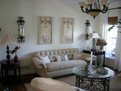
In the first photo she notes that her coffee table is topped with glass, whereas in the second, she's replaced the glass with brown barn wood as a topper. I love the grounding effect on her room! She also added a pillow with black details to her sofa, which picks up the dark wood perfectly! Besides the coffee table, Maryanne made lots of changes to this gorgeous room and it was fun to study the photos to find them all. She now has a heavenly, delicate chandelier replacing the light fixture and has placed a gorgeous old-world mirror over her sofa. I meant to ask her where the mirror is from, but forgot. She also switched her candle sconces to a pretty old-fashioned pair.
 Besides the coffee table, Maryanne made lots of changes to this gorgeous room and it was fun to study the photos to find them all. She now has a heavenly, delicate chandelier replacing the light fixture and has placed a gorgeous old-world mirror over her sofa. I meant to ask her where the mirror is from, but forgot. She also switched her candle sconces to a pretty old-fashioned pair.
I love all the touches in this room, including her unique lamps flanking the sofa (the same in each photo). The coffee table is too-die-for! I also adore her regal tufted sofa and the beautiful French bergere (armchair) you can see in the second photo. I was surprised to learn that it came from Ethan Allen!
I also like the little flying cherub that sits to the left of the sofa in the first photo. You can see him reflected in the mirror of the second photo - he now sits atop a table near the front entrance, greeting guests.
I admire Maryanne's living room because it's light and airy but has a balancing mix of dark elements. And although there are many feminine, romantic lines, there are also some grounding masculine touches, like the dark barn wood topper, her darker end tables, and the square lines of the mirror. I think she has found the perfect balance. She also has beautiful things, so it's hard not to love them all!
Hope you've enjoyed your visit to Maryanne's home. I know I have! And I've asked her to send me more photos...








I have recently begun to realize that there are many, many people out there who change things around as much as I do! I need to report this to my husband, who thinks that I am crazy for wanting to rotate things in and out so much.
ReplyDeleteExcellent blog, till date i would rate this blog has one of mine best cn blogs..hey you wanna coffee tables then you can have a look on my site http://www.casamodern.com/coffee_end_tables_india-7-37.html
ReplyDeleteNow that was an interesting study with both photographs. Mimi did a wonderful job with her living room. I liked both, but would've chosen the second as my favorite and probably would have not analyzed why. Thanks for the comparison study!
ReplyDeleteGreat transformation! I'm chomping at the bit to get to work on my new house...ideas are swirling in my head! Thanks for the great peek into a readers' room!
ReplyDeleteoxoxo
I actually like the before AND the after and like Sarah - it's nice to see we aren't the only weirdos who change their house around every minute or two.
ReplyDeleteWow, I thought the first room was lovely.
ReplyDeleteThey are both beautiful. Maryanne did a wonderful job. Thank you (and her) for the tour.
Have a wonderful weekend, Terri.
xo
Brooke
oh, yes, that's a very nice room, it looks very inviting. A few accessories can really make a difference...
ReplyDeleteHow nice that you share these pics with us .
Hope your back is doing better and I wish you a nice weekend.
Solange
you have such a lovely blog !!
ReplyDeleteJust so lovely!! I really liked both rooms!
ReplyDeletexx-Gina