
Friday, July 06, 2012
Shop Love: "Rook & Rose" in Victoria

Saturday, April 23, 2011
Roman

Monday, December 06, 2010
Christmas Beginnings...


Sunday, June 20, 2010
Lovely things from Home


Sunday, May 16, 2010
Thomson & Hanson: Inspiration Art


Tuesday, April 20, 2010
Hello, Pretty Things!


Friday, November 06, 2009
Duvet or Not Duvet?

My favorite bedroom from Ideal Home magazine
I’ve been spending a lot of time lately contemplating bedding.
No, I'm not contemplating the usual dilemma of how many pillows. Nor am I thinking about how to make it look nice. I am thinking instead about making my bed FEEL insanely good. I want it to be almost impossible to get out of in the morning! Considering I am not a morning person, this could be a dangerous proposition.

We need a few new things in this department. But I am torn between buying a new duvet and duvet cover, or getting us a good woolen blanket or two.

David prefers heavy blankets and layers. So oftentimes in winter, I make up the bed with a couple of blankets (I have a good cotton one and some inexpensive fleecy ones), a quilt or two, and maybe even our little mini-duvet topper on top! It is very cosy, but I move around a lot in bed (I have a bad back) and cannot stand heavy layers.
I am a duvet girl. The fluffier and loftier the better. I like a duvet with a flat sheet under it so you don't have to wash the cover all the time. And duvet covers are much faster to make up for busy working girls!

For winter, we currently use a king-sized duvet (turned sideways) on our queen-sized bed. I bought it because I couldn't stand how queen duvets seemed to barely reach over the edge (12-14", although Pottery Barn's and some others have a 16" drop) and my flat sheets were always showing underneath (I don’t like having to tuck them in!).
The king duvet seemed like a good idea at the time, but now I think a king-sized duvet is a little unwieldy on a queen bed. For one, it hangs down too far at the foot of the bed when we turn it 90°. When we turn it the correct way, it hangs down too far on the sides and seems to drag heavily off the sides of the bed and not puff up properly and conform to your body.
So now I am contemplating a queen-sized duvet again. My last one is a feathery mess and it's time for a new one.

But I also like quilts. I bought a wonderful silk quilt in Paris (a European size 100”x100”, meaning it overhangs the side of my bed by 20”, which is a little too far, but it just looks more like a bedspread/coverlet). I would like to use this all year round, but it’s thin, so I really should invest in a new blanket or two. I thought a good wool or alpaca blanket might be a nice investment. A baby Alpaca and merino wool blend blanket goes for about $200 here, minimum.


I really hate all those layers but Canadian winters are cold and we keep it slightly cool at night, around 62F (17C) and sometimes have the window open for a nice chilly draft!

In the meantime, I was curious to know what your preferred bedding is.
Do you prefer duvets or stacks of blankets? Do you use appropriate sizes for your bed or go oversized? Do you use a featherbed (I want one!)? What kind of blankets do you like (cotton, fleece, wool, synthetic)? Where do you buy your bedding?
And last but not least, what are your bedding true loves and pet peeves?
Perhaps we can discuss pillows in a future post! I know that is always a hot subject.
Photos: 1,2,9: Ideal Home
Photo 3: Pappas Miron
Photo 4: Art & Decoration
Photo 5: David Oliver
Photo 6: Windsor Smith
Photo 7: OKA Design
Photo 8: Shoot Factory
Sunday, March 30, 2008
Decor Planning: My Living & Dining Rooms


I've also been hunting for fabrics for new drapery panels. I've finally settled on linen as my fabric of choice because there seems to be a solid selection and some very pretty colours at the shop I chose to sew my projects. I will have them make panels and a new valance for my dining room.
I've been meaning to post photos of the room and ask for your help. But instead, I became obsessed with doing it myself. It seemed too hard to try to photograph all the disparate elements of the room and explain everything. Eventually I'll re-upholster a chair, slip-cover another, re-frame some prints, and so on and it seemed too tedious to explain it all to you! In the end, there were the choices my heart wanted and then the sensible choices that worked best for the room. Decorating is a balancing act when you can't do a whole room from scratch!
This week, I'll do some measurements and hopefully have the shop start sewing my items (unless I change my mind). I haven't settled on an exact paint colour yet, but at least I picked a palette and have some front-runners lined up!
Besides that I've been voraciously reading design books and have fallen in love with Michael S. Smith's gorgeous book "Elements of Style" which is just what the doctor ordered this week for some serious aesthetic inspiration!
Hope your week is wonderful! I'll share some photos of my ideas soon.
Photos: House of Linnea
Thursday, March 06, 2008
Farrow & Ball: 18 New Hues
Today, I visited Maria Tomas, the only Farrow & Ball retailer here in Calgary (luckily a few blocks from my office) to view the new colours.
I was positively smitten with several of the colours and especially loved the first eight, which I've included below:

There's a new white (No.239 Wimborne White), an elegant tan (No.240 Cat's Paw), and my three favorites: a creamy stone off-white (No.241 Skimming Stone), a noble light gray-blue (No.242 Pavillion Gray), and a refined dark gray-brown (No.243 Charleston Gray).
I've also shown a handsome dark brown (No.244 London Clay) which looks beautiful next to a pretty pale pink (No.245 Middleton Pink) and a gorgeous dark rose (No.246 Cinder Rose). I've been dying for rose to come 'round again!
You could steal this palette alone and design a whole house (minus the tan, perhaps!).
Check out the remaining 10 colours at Farrow & Ball.
All paints are made at the Farrow & Ball factory in Dorset, England. The company is renowned for using "more high quality pigment in every tin than any other manufacturer." Since all paints are factory-blended and quality-controlled, colour accuracy is assured. In other words, no blending is done at your neighborhood shop!
Sophisticated designers rave about paint, but it's a rather expensive at over $80/gallon here in Canada (which is about $20 per gallon more expensive than Benjamin Moore's top-of-the-line paint). The paint is supposedly a little finicky to apply as well, so a confident painter and good instructions are a plus!
I can't wait to try a gallon for myself, perhaps Pavillion Gray, my new favorite hue!
Friday, February 29, 2008
Tidewater Landing, a lovely palette

A coastal home in Virginia:
Entrance hall painted in Benjamin Moore's Hazy Skies (OC-48) with Acadia White (OC-38) trim.
I've just come across a lovely coastal home in Chesapeake Bay, Virginia, featured in a past issue of Coastal Living. This gracious home encapsulates a colour palette I've been considering for a while...you see, I've been smitten with the notion of painting my main floor (dining and living rooms) blue! And I'd like to carry the blue into the rest of the house, along with lots of white and touches of linen brown (at least this week...)
Currently, our whole main floor (living, dining, foyer, 2 stairwells and upstairs/downstairs hallways) are a pretty chartreuse-green colour, which is warm and inviting. But the walls have a lot of nicks and chips and need a fresh coat. So, why not try something new?
But I'm struggling with this blue concept, since blue can be a little cold if you don't choose the perfect one. And I don't have an ocean outside my window for context (and to make it entirely unnoticeable). My living and dining rooms (not to mention the foyer) are naturally what one sees when one opens the front door, so I want these rooms to be as welcoming and warm as possible. Luckily, the foyer and living room face south, so the whole space gets tons of natural light. My furniture is sage green (and the new rug is beige and blue and green), so it's already a warm-enough space. But the existing greens are so inviting and cozy that I'm afraid to change. So I'm tempted to be a bore and repaint in the original colour or do a greenish version of blue.
But I'm so fond of those gentle pale blues, as shown in the living room and dining rooms below:


In these rooms, I also like the use of those linen browns and whites with small dashes of brighter complementary colours. I love this combination and it seems a natural fit for our house since the downstairs (family room floor) already has lots of brown (a brick fireplace, wood library panels, off-white berber, brown linoleum in the hall, taupe walls, brown linen curtains, etc.)
If I go with blue on the main floor, I'd prefer a different colour for the two stairwells and hallways that lead to the other two floors. For these, I'm considering ivory (like my master bedroom, which is White Down from Benjamin Moore). But I also like the idea of a warm pale brown (like Maritime White by Benjamin Moore, which is a beautiful milky coffee-ish colour) or perhaps a greige/grey colour, like that shown in the main entrance (first photo above) and the landing below:


I think the possibilities are endless here, don't you? Now, if I can only stop changing my mind long enough to paint...
Monday, February 18, 2008
Flowers & A Housewarming Present


Friday, February 15, 2008
My blue

Ever since I was a little girl, I've loved the colour blue most of all. How does a child make a spiritual connection to a colour? And how does it last a lifetime? How did the colour blue become something I feel connected to, as silly as that sounds?
*

The drapes I saw were like these, a pale-grey blue, possibly my favorite shade of blue
*
Since then, I see blue whenever it's there. Little splashes of blue, a faint blue in the corner, a soft blue blanket. It's attracts my eye like never before. And I still dream about those blue drapes (and intend to have some made for my living room, eventually). I have plans for a blue laundry room and perhaps even a blue bathroom. Blue works with my desired palette, which will eventually mean a house full of whites and creams, browns, and blues. I will still have my dashes of pink and greens, but slowly I want to move towards a very au natural earth-sea-sky inspired palette.
*
I think it's all about choosing the right blue and using it carefully, artfully. It's a serious colour and despite its quiet charm, can be handled very badly and can look very flat and boring. A little goes a long way!
*
So without further ado, here are some rooms that make a rather persuasive case for blue (all photos from Domino, unless otherwise stated).

Above: A traditional blue room where liberal use of white freshens up the abundant blue (from Southern Accents)
Above: Exquisite blue china, almost electric blue! Best used sparingly...to match your jewels perhaps?
Above: A very fresh bathroom in a curious shade of blue
Above: A graciously restrained blue country room (Country Living)
Above: Handsome slate blue. Dark slate blue is my favorite blue next to those pale grey-blues (Tom Scheerer Design)
Above: My kind of nautical...restrained, quiet references
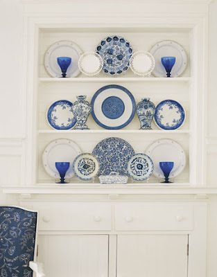
Above:: Showcasing a smart blue china collection, definitely someone's cup of tea! (House Beautiful) Above: Remarkably quiet for such a detailed room (Tom Scheerer Design)
Above: A traditional chair, regal in navy blue suit-like fabric
Proof that blue doesn't have to be meek!