Showing posts with label my DIY projects. Show all posts

Tuesday, July 14, 2009

Final Paint Experiment on my Mirror!

Final result:  a weathered pearl silver finish over a taupey base

I really hated the chocolate brown paint colour I showed on my mirror in the last post.  So last night I decided to paint it again, this time a lighter brown.  I mixed up a batch of the leftover dark brown (HC-70 Van Buren Brown) with some Cloud White I had on hand until I achieved a nice milk chocolate colour.  I even threw in a few drops of Flax, a pinkish brown, to give it a rose cast:  
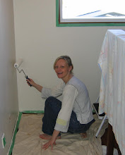
This effect seemed only vaguely less dull than before.  I liked the colour, but it lacked a certain je ne sais quoi.  So today I tried my first attempt at a faux finish.  At lunch time, I dropped by Benjamin Moore (luckily there's a shop one block from my office!) and bought a pearlescent base paint that gives a pearl-like lustre to your finish.  

When I came home, I started by dry brushing a very thin layer of the F&B Charleston Gray on top of the brown, on the raised bits only, to give it a little depth (following Mrs. Limestone's suggestion).  Sorry, I forgot to take a picture of this step.  When it dried, I added the pearl finish randomly all over, to give it a little lustre:
The mirror looks quite good (sort of silvery and weathered-looking), but in the photo, the finish looks a little spotty.  Since I'm not a machine, and it was my first attempt, I wasn't very good at applying the layers evenly, so it looks a little splotchy in places! 
But I think it gives a really wonderful effect (I just need some practice and no close-ups)!  And unless you inspect the finish closely, the effect is lovely and interesting from a couple of feet away.

I applied a lot of the pearlescent glaze at the end, but if you want a simple weathered look you can stop after the second layer.  You can use virtually any paint colour and then simply add a lighter highlight colour by brushing over the raised surfaces only.

In my case, I used: 
1st layer:  A mixture of Van Buren Brown and Cloud White, to give me a medium brown taupey base. 
2nd layer:  A light superficial brushing of F&B Charleston Gray on the raised bits (for highlight), using a small firm brush
3rd layer:  For lustre, a layer of Pearlescent base from Benjamin Moore. 
There's a whole range of gorgeous pearl effects that can be achieved using the pearl base over a regular eggshell.  Benjamin Moore has a whole brochure of pearlized colours that you should check out.  I can't wait for my next project...
Oh, and I didn't like the way the mirror looked in the entryway, so I have moved it to the sideboard where it fit in with all my silvery things.  But now I'm back to square one, with no mirror I love in the front hall...

This is so typical of my decorating style - I never end up using things where I plan to!

Sunday, July 12, 2009

A Farrow & Ball Experiment: Good Colour Gone Bad

This weekend, I finally got down to business and painted the gilded golden mirror from my front hall.  Sorry, I forgot to take a before picture, so I snapped this right after I tried the first stroke of paint:  I have owned this mirror for 18 years - it was part of a trio of affordable antiques I bought at a shop in Montreal as a student.  This photo was taken in my comfy, cozy family room (which you never get to see... it needs a decor intervention) where I could paint whilst watching HGTV! I was getting a little bored with the golden look, so I decided to paint it Farrow & Ball's Charleston Gray, which appears to be a milky medium brown with a gray undertone on the card... However, the mirror basically turned out a taupey-gray, reading much more gray than brown after two coats.  
You can really see the difference in lower light:
I will note that the finish doesn't look great because I painted it with an eggshell finish (since I used a $7 sample pot and this was the only finish available) and planned to urethane it with a semi-gloss when I was done.

But I was very unhappy with the colour and didn't bother to finish it.  I wanted it browner, like the card, to match a brown rug I have in the foyer and pick up the brown lamp in my living room (which is an almost identical shade to the card).  I do like this colour - complex and unique, but it looked like total crap on my mirror.  

Since it was now Sunday and Maria Tomas (the Farrow & Ball supplier) was closed, I went to my local Benjamin Moore store and bought a chocolate brown, called Van Buren Brown (HC-70), which I have read decorators rave about in House Beautiful (I read their "Color" pages in each issue religiously).

Here is Van Buren Brown, in progress:

And on the wall (below).  The colour is much too dark, but at least it coordinates with the darker tones in the furniture.  This is after a single coat!
I'm happy to see that the colour matches the chip, perfectly:  
The colour looks just like melted chocolate and is quite lovely, but too dark.  I will note that I went darker than I wanted because, in the past, Benjamin Moore colours have looked significantly lighter on the wall than on the card...(with three shade I've tried to date).  So now I will have to paint a second coat and mix in some white paint to lighten it.

Eventually I want a new, much larger mirror in this location, and I really need to add some art.  But for now, I hope it will suffice when it's toned down a little.  The brown will coordinate with my cushy brown rug and my rose-pink light fixture.

'Til next time...

Sunday, February 15, 2009

Office: Desk Reveal!

Last week I blogged about the ugly table I'm using for my office desk. I made lofty plans to cover it with fabric and glass, thanks to a suggestion from Joni at Cote de Texas.

I'm sorry to disappoint, but I didn't do as fancy a treatment as I'd planned. I decided it didn't make sense to bring the fabric across the front. As some of you mentioned, it wouldn't look very nice with the chair pushed in. And also, it would require a center pleat for sitting.

That was enough to discourage me. I wanted something simple that didn't cost a small fortune. My tailor is a posh dressmaker and could make anything, but I really didn't want the cost of fancy pleats. So I got her to do a simple hem (after she serged it). I love the way it looks but think I might bring the near-end all the way to the floor.

I bought 3m of plain linen for half price (about $35 total), did my measurements and took it to the tailor (who charged $20). I got glass cut the same day for $108. I did not get a bevelled edge (which cost $50 more). It is simply sanded round at the edge.
Biscuit really enjoys the fabric and likes to hide behind it.
I decided not to iron the linen. The tailor gave it a quick press, but I prefer the wrinkles!

I was so excited to get it all together but was shocked to find that my mouse doesn't work on glass! It needs a mouse pad now.

Here's the other side of the room:

I haven't decided what to do here. We sorely need some office storage but don't want to spend any new money! The table is great for holding things and for projects, but I hate the clutter that accumulates there and really need some file storage. Please ignore my ugly black shredder under the table (I should have moved it for the photo - bad stylist that I am!)
So I'm thinking of putting a chaise here and perhaps a tall cabinet near the window for storage. For now, it suffices and I've styled it with recycled art. I love this pheasant print by wildlife artist M.G.Loates which I bought it at a church auction for $10 (and will eventually re-frame).
The basket is for electronic stuff like iPods, cords, chargers, and cameras (I put a soft cloth at the bottom).

I still have to install curtains and some shelves over the desk. I toured Home Depot yesterday but they had a terrible selection of shelves (actually plenty of shelves but very ugly brackets), so I will check Ikea. More soon...!

Saturday, February 14, 2009

About A Mirror (please help!)

My favorite antique store has a mirror I admire.  I like the unusual shape and detail.  The price was recently reduced and I'm considering buying it.  You see, I have a thing for mirrors (an illness really).  

I would place it in our living room or perhaps the front hall.  And no, we don't need it.  It's been in the shop since summer and I was shocked to still see it there today - her stuff moves fast. But the price is a little steep, so I might make her a lower offer.  

Here's a closer view:
The bottom (blocked by the lamp) does not have the same flourish of detail as the top but is just rounded (like the sides).  I find it quite pretty and odd.  

I don't care for the gilded (gold) colour and would consider painting it.  To get a feeling for what it would look like painted, I photoshopped the photo to show different paint colours.  

Metallic Chocolate Brown (I love this):
White (not so much), but cream might be nice!
Black metallic (nice also)

I'm even considering a grey or taupe:

The possibilities are endless.  But I'm wondering:
(i) do you like this mirror (or is it too granny)?
(ii) do you think it's a crime to paint it (it is an antique and has a lovely crackle to the glaze)?

Opinions are always a helpful reality-check, so give me yours!

Friday, February 06, 2009

Desk Makeover: Plans

This photograph (from Domino) shows exactly how I intend to make over my office desk to look more appealing!  The photo shows a table covered in linen (with side pleats and lacing) and then topped with glass.  How gorgeous is that?

Our office desk (shown below, in an old photo) is actually an old kitchen table.  It really needs a makeover.
I prefer to re-purpose it as a desk instead of buying a new one because:

(a) it's a comfortable height, a little lower than standard desks (those are too tall for typing, for me, unless there is a keyboard tray)
(b) it's available and
(c) it's free!

Plus it has lots of width for sitting things and piling books (as I am wont to do).  And we have an extra leaf that I will probably add to make it longer.

The only trouble is, it isn't terribly attractive and David forbids me to paint it (it's from his bachelor pad days).  So I was feeling a bit hopeless until Joni, the decorating goddess from Cote de Texas, saved the day by suggesting that I cover it in fabric and put a piece of glass on top.  

When she mentioned covering it in fabric, it instantly occurred to me that I had seen this charming linen-covered table in Domino!  So I hunted down all my issues and spent about 2 hours flipping pages until at last (literally) I found the photo!

Isn't it a lovely idea?

But before I even started fantasizing, my cheapskate/practical side decided to get a budget quote on glass.  So far, I have estimates from $110-160, so it's quite reasonable.  The more expensive quote is for a bevelled edge.

The trouble will be sewing!  I have a machine but don't recall how to use it, and I am not a great seamstress to start with.  I don't have a cheap tailor and the decorating stores charge a small fortune. I figure if they charge $700 for a slipcover, this weird custom job likely won't be less than $300.  It's a few straight lines, but still, they take their time and have to charge for it, and the pleats add some complexity.

So, I'm going to try to source some fabric (linen, and I'm thinking similar to what I used on the bulletin board, or perhaps beige with a white stripe) and see if I can do the sewing myself.
If I do, it will need to be very rudimentary since I can't do pleats - simple hemming is bad enough!

But if I take the fabric across the front, I will need a center cut (open pleat) to make it possible to sit comfortably.   So maybe I won't bother to cover the front, in which case I need more of a wide runner just to cover the top and the ends.  Not as elegant, and not as much coverage, but at least decorative and more practical.

Lots to think about, but the plan is in the works!  Sometimes I think I should just get a new desk and call it a day.  

What do you think?

Tuesday, February 03, 2009

~ Our Home Office: Debut! ~

At last - one half of our home office is complete! The other half of the office (where the desk and the old farm table are located) will undergo its own transformation in due time. Then I shall reveal the whole thing...
For now, I'm delighted with the colour of the furniture! It's so gentle. Once the paint was dry, I spent much of Sunday afternoon reorganizing things. The brown fabric boxes on the shelf are from Martha Stewart. They were expensive, so I waited until I got a sale coupon and picked them up for 40% off at Michael's. They are lined inside with a brown & white plaid! I use them for my stationary.

To be honest, now that the furniture is painted this soft blue, the darker blue wall colour doesn't thrill me anymore. I think a soft cream or pale linen brown would be prettier. But for now, I'll leave it as-is. I still need to paint the trim work (soon) and slipcover the armchair. Although David and I are now considering putting a chaise, small sofa, or daybed in here, so the armchair might get the boot!
I think the space looks a lot more tranquil. The little dresser (which I shall put a mirror over) holds bills and house files, and I bought some white storage boxes at Ikea. The big ones on the floor hold files and the small ones on the shelf hold jewellery and craft supplies!
I also treated myself to a bulletin board makeover. I had bought a cheap corkboard at Michael's, and this weekend I covered it with plain brown linen from Fabricland, a relatively inexpensive fabric shop.
I used a staple gun to attach the linen to the frame at the back. I also bought some pure white braid and added trim work (and a bow!). The trim is a little feminine for my liking, but I think I'll leave it pretty for now.
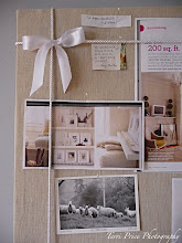
Now I have a home for all my inspiration pictures (which I often photocopy from magazines instead of ripping them out).
Here is the other side of the room (opposite the bookcase) which we don't have well organized (sorry the picture is kinda tilted)!

I know decorating magazines complain about displaying family photos too prominently, but I think that's rubbish - we like to see our loved ones every day (even if they're not in classy black & white)! Eventually I'd like the built-in bookcase to look more coherent, so I may re-frame a few items and style it a bit.
I also covered a small bulletin board (below, $5.99 from Ikea) with linen, for snapshots and postcards. I'm not smitten with the location, but I'm running out of walls, and it's accessible for quick changes.
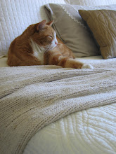
Biscuit really likes the new room as he looks best in complementary colours.
I will share more with you when I attack the other end of the room. I'm now thinking about putting a cozy chair (and footstool), daybed or sofa in here, so we may remove the big table. David & I often spend time in here together, so we need a little more seating.

In the meantime:

* I must hang curtains (white cotton)
* I have big plans for the desk thanks to a suggestion from Joni at Cote de Texas
* I have to install some shelves and figure out some art work for over the desk
* See where we can fit a chair or daybed!

Stay tuned!

Saturday, December 06, 2008

Home Office in Progress

Hello!  I thought I would share some pictures of my home office, which is in progress.  Unlike the oh-so-talented (and brave!) Mrs. Limestone, I will not be posting pictures of this room on Rate My Space .  I am not nearly that courageous!

What I am proud of is that I've managed to put this room together without spending any new money, using things we already own.  But I do desire a new rug, some repainted furniture, and some fabric updates.

Without further ado, here's the room:
The blue dresser (above) came with the house.  I'm presently using it for files.  I'm trying to decide whether to re-paint it (a different colour) - or perhaps a fresh coat of blue and some new knobs will do the trick?  I'd prefer it to match the bookcase (below)...eventually.
A close-up of the dresser:  The big bowl is for bills (I'm behind on my filing).  The cork board ($5.99) is from Ikea.  I plan to either paint the corkboard or cover it in fabric.
A close-up from the bulletin board:   This photo shows my parents' home in eastern Canada, last winter!  It's a cozy and idyllic country spot, nicely forested and with views of the river.
An Ikea bookcase I've had a while:  I like the weathered grey-green colour but once I replace the rug, I think I may repaint it (and the wee dresser) either blue, white or sage green.  Jewellery is stored on the third shelf in small boxes.  Office supplies are in the orange box at bottom.  I originally considered installing a curtain on the front of the bookcase to cover the clutter, but might leave it open.
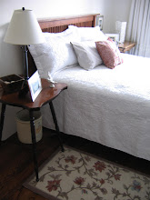
Here's the room:  Our computer table is a kitchen table from David's old place.  He doesn't want me to re-paint it, but I'd like to keep it because it's the perfect height and size.  In this picture you can see the rug, which is "no longer me" (not that it ever was - it was just cheap!).  I bought this many years ago from Home Depot and it has serviced many rooms. It's colourful and not terrible, but I'd prefer to replace it with something pretty and neutral.  I saw a delightful ivory-white wool rug at Ikea, but I don't want to spend much money! 

The old grey armchair (its twin sits in our living room) is in dire need of re-upholstering and may be re-finished, once I figure out my colour scheme.Our work station, with the new iMac.  I love this computer (after spending the last 3 months cursing as I learned how to use it).  The painting is by an accomplished Quebec artist named Pierre Bedard. It was my first real art purchase a couple of years after getting my first job in Toronto.  It's a Chagall-like winter townscape that I love and want to keep in the room.The small lamp on the left-side of the table is a Grono lamp from Ikea, which I covered in a Martha Stewart gift wrap, to dim its light a little.  Grono's come in packs of two and make lovely accent lighting, especially once covered in pretty paper.On my desk, the silver pencil cup came from Paris. I'm using a little paper box for scrap notepaper.  A glass heart container I've had for years holds my memory stick and USB gear.
The other side of the room...with my clutter table.  This is a beautiful country table I bought at auction for $280.  It now serves as a repository for all my clutter.  There's another Grono lamp sitting atop it.  I don't have my curtains up yet - the white rod and a pile of curtains sit near the window!  I will de-clutter this space, and deal with the boxes beneath eventually. 
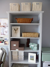
A built-in bookcase that I really like.  I have tons of family photos and eventually want to style this a little and add more shelves (likely in white) above the big table.

Well, hope you like it!  Do you have any suggestions for a new rug colour (other than white?) and a colour to paint my wee dresser and book case?  I think a blue rug might be nice, with white furniture, if I could ever find a blue rug in the right shade.  Or perhaps a white rug with sage green or light blue furniture?  What do you think?

Then I'll add fabrics (on the corkboard, the armchair, and pillow) to complement the scheme.  Your suggestions are welcome!