
I thought it was high time for me to reveal my new blue guest bedroom!
Earlier this month, David and I painted this once-green room a very pretty shade of Farrow & Ball-inspired blue.
I originally chose F&B's "Skylight" for the room, but wanted a lighter shade of that colour. Knowing that F&B doesn't do custom blends (and not trusting my paint mixing skills), I got Benjamin Moore to make me up a custom batch of "light" Skylight. It is a truly gorgeous porcelain blue with a hint of grey. The photos don't do justice to this graceful blue:

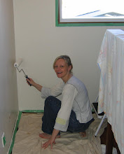
As you can imagine, painting this built-in bookcase was an almighty nightmare. First, we painted the entire frame with two coats of Benjamin Moore's "Cloud White". Then I taped around all 26 back rectangles (groan) and we painted the blue rectangles (two coats!). In all, painting the bookcase and the rest of the room took us three weekends, with prep and taping and moving things. I have a terrible back and was laid up for two weeks afterwards, I swear!
Here's the bookcase pre-painting (filled with cookbooks and clutter!). The room was a pretty but dated green:

I think the blue and white is a vast improvement:

Here's a closeup of a quickly-styled shelf (Suzanne Kasler would be proud - she loves a soft blue room):

I have not filled the shelves yet as we still intend to sand and paint all the ugly brown trimwork in the room. I'm also planning to move the utilitarian books and clutter and make this a more beautiful display area.
David and I sleep in this room all summer, as it is partly sub-terranean and delightfully cool! So I want it to be lovely for us as well as guests.
This room still needs a lot of work. I have big plans but a small budget.
Besides painting the brown mouldings, I intend to buy:
1. a beautiful antique night table (this could take a while!)
2. an inexpensive window treatment
3. new closet door hardware
4. a new light fixture and table lamp
5. all new bedding!
6. a headboard, maybe home made
Here's where I need you. I am totally helpless when it comes to this window:

As you can see, I left the existing valance structure in place (previous owner), thinking that I might replace the valance with a simple white linen one (the previous one was Velcro'd on, for easy switching), and just leave the blinds. We like having blinds as they block the light well and David opens the left window sometimes at night, so having separate blinds can be helpful, especially for opening and closing in the middle of the night!
I would love a single white linen Roman blind. But the double blind setup is practical and these old ivory metal Hunter Douglas blinds work like a charm. New blinds never have mechanisms as good as the old ones! Economically, it doesn't make sense to replace them, although white would be nicer if I wanted to simply replace in-kind.
I would actually love some softness here but how do you arrange curtains at a window like this? The ledge is quite deep (6") so curtains will not hang to the floor. I've been thinking of draping muslin neatly across the valance and then down the sides, but don't want a Shabby Chic hippie look!
Any suggestions for this crazy window?
In the lighting department, I think something simple and classic would be best, like this affordable fixture from Hudson Valley:

Oddly, the light fixture in this room is in the corner, to the left of the window, so a slightly narrow tall fixture would fill the space nicely.
I also love this French-inspired chandelier from online retailer Goldenage Chandeliers. It would lend a welcome French feel to the room, but I think it's a little too glamourous with my humble "oatmeal" berber carpet (that isn't being replaced!).

Something simpler might be better-suited.
P.S. And yes, the bed is snug against the wall on one side. The room is tiny and this works best...I find it very cozy. If the bed is moved out, there is almost nowhere to walk and it makes the room really cramped.
I'd love your suggestions, especially on my window (light blocking is a must!).
I can't wait for your comments!
 I have owned this mirror for 18 years - it was part of a trio of affordable antiques I bought at a shop in Montreal as a student. This photo was taken in my comfy, cozy family room (which you never get to see... it needs a decor intervention) where I could paint whilst watching HGTV!
 I was getting a little bored with the golden look, so I decided to paint it Farrow & Ball's
  However, the mirror basically turned out a taupey-gray, reading much more gray than brown after two coats.


 The colour looks just like melted chocolate and is quite lovely, but too dark. I will note that I went darker than I wanted because, in the past, Benjamin Moore colours have looked
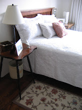
 This room is perfect too - I love everything about it! But it's the bed frame (upholstered, ivory linen) that I adore most. The bedding is also perfect - simple and classic and full of character. (Photo:
  Another perfect bed frame - upholstered ivory linen, with a monogram. I'll take it! And the bedding is simple and soft. I'm not a fan of the rest of the room. (Photo:
 Another delicious room - the wall colour is almost identical to what I've chosen, and I plan to do white window coverings too. The bedding is exquisite and I love the "textile as headboard" concept! (Photo:
 A close-up of a pretty Gustavian headboard. I would not use a checked fabric, but I love the classical simplicity of this style. I also like the natural linen-coloured quilt! (Photo:
  A soft linen valance. I like ivory or natural linen best. (Photo:
 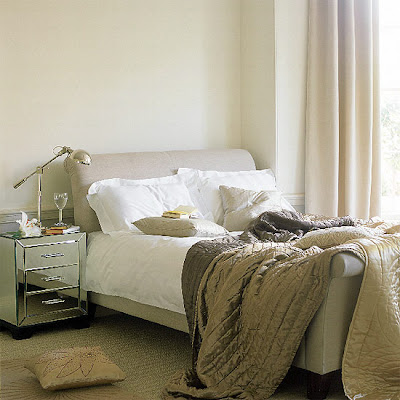 This is the most suitable headboard, although I do not care for a sleigh-bed style frame. I prefer the headboard as it isn't too high, which would work better in my space since the bed will sit in front of a window! (Photo House to Home UK).


