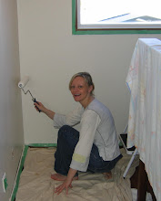
 I have owned this mirror for 18 years - it was part of a trio of affordable antiques I bought at a shop in Montreal as a student. This photo was taken in my comfy, cozy family room (which you never get to see... it needs a decor intervention) where I could paint whilst watching HGTV!
 I was getting a little bored with the golden look, so I decided to paint it Farrow & Ball's Charleston Gray, which appears to be a milky medium brown with a gray undertone on the card...
  However, the mirror basically turned out a taupey-gray, reading much more gray than brown after two coats.
You can really see the difference in lower light:

I will note that the finish doesn't look great because I painted it with an eggshell finish (since I used a $7 sample pot and this was the only finish available) and planned to urethane it with a semi-gloss when I was done.
But I was very unhappy with the colour and didn't bother to finish it. I wanted it browner, like the card, to match a brown rug I have in the foyer and pick up the brown lamp in my living room (which is an almost identical shade to the card). I do like this colour - complex and unique, but it looked like total crap on my mirror.
Since it was now Sunday and Maria Tomas (the Farrow & Ball supplier) was closed, I went to my local Benjamin Moore store and bought a chocolate brown, called Van Buren Brown (HC-70), which I have read decorators rave about in House Beautiful (I read their "Color" pages in each issue religiously).
Here is Van Buren Brown, in progress:

And on the wall (below). The colour is much too dark, but at least it coordinates with the darker tones in the furniture. This is after a single coat!

I'm happy to see that the colour matches the chip, perfectly:
 The colour looks just like melted chocolate and is quite lovely, but too dark. I will note that I went darker than I wanted because, in the past, Benjamin Moore colours have looked significantly lighter on the wall than on the card...(with three shade I've tried to date). So now I will have to paint a second coat and mix in some white paint to lighten it.
Eventually I want a new, much larger mirror in this location, and I really need to add some art. But for now, I hope it will suffice when it's toned down a little. The brown will coordinate with my cushy brown rug and my rose-pink light fixture.
'Til next time...


What about dry brushing a little of the original color over the brown to pick pick up the details and lighten the whole look?
ReplyDeleteI can't get over how different Charleston Grey looks in the chip. That's false advertising! I think it will look beautiful when you paint it the paler brown.
ReplyDeleteOh yes, and this is why I dislike painting so much. And, call me crazy, but I do think that paint is expensive. I know that you will figure it all out, though. Lovely mirror with great details...
ReplyDeleteI was just going to suggest dry brushing the original color over the top but Mrs.Limestone beat me too it :) Either way I like the dark brown color you picked!
ReplyDeleteColor is hard, thanks for showing us your process, it was fun to see the transformation. Always good to be reminded about the power of paint!!
ReplyDeleteTricky with colours that change shades... But I did like the first grey even if it did not go very well together with the rest of your home. The brown I did not like at all, sorry. I cross my fingers and hope that you will end up with the right colour.
ReplyDeletexo
Poppins
I am 100% in accordance with Mrs Limestone. I do love the melted chocolate however and am thinking of using it for a small project. However if it does not fit with the rest, the dry-brushing of original color would be perfect. AND very very French...
ReplyDeleteLouise
Kill me now, but I would paint it primer red, gold leaf it, do a glaze of raw and burnt umber over it, sand back to show various shades below. I know, I am a time warp.
ReplyDeleteCool mirror with a huge possibility of finishes.
ReplyDeleteLeslie
F&B sample pots are in the flat finish, not an eggshell. The colors in the color card are printed and are not perfect representations of the colors, which is why they sell the sample pots. They are intended to be applied with two coats, which also changes the intensity of the color as nothing from below will bleed through.
ReplyDeleteAnonymous - my error - yes, I was aware it is a flat finish - I incorrectly wrote eggshell. My intent was to urethane it after for gloss.
ReplyDeleteI did paint two coats.
And I think the colour cards should look more like the real colour. I know they are "printed" but they should be printed to look like the real colour in natural light, which this one does not remotely look like. I understand a slight discrepancy, but this one is quite far off. I have found several other F&B colours to look more like the chip - I have tried about 10 different sample pots and most were closer than this one.
Thanks for the comment.
Thanks for this. I really wanted a grayer grey so for me that colour is perfect. I was put off by the brown as i want it for my whole living room! Super helpful post!
ReplyDeleteThese are generally short phrase loans that do present you meet your fiscal difficulties inside a desired specific time period.
ReplyDeleteThinking about time limitations these loans are particularly created above
an obligation cost-free platform. As such, these are kept totally cost-free from credential checksums.
Concerns such as defaults, arrears, bankruptcy, CCJs
and even IVAs are not regarded as right here.
Further, there are also no collaterals associated with these loans.
There is minimal paper work necessary on the part of borrower.
There are also no hidden or added documentation or faxing essential
right here. Applying for these loans is also really handy.
Folks just demand filling an internet form and when this gets approved money is
received inside 24 hours time frame. These loans are usually provided under convenient terms and conditions.
The basic standard applicant criteria here is that they will need to
be a UK resident and of 18 years of age.
My web page :: click
you should have used the right undercoat for the f & b color then i would look like on the sample I guess. Thats my experience with the color. Just chose charleston gray for my entry room and it looks just like on the sample I must say 8with the right undercoat).
ReplyDelete