Saturday, February 14, 2009

About A Mirror (please help!)

My favorite antique store has a mirror I admire.  I like the unusual shape and detail.  The price was recently reduced and I'm considering buying it.  You see, I have a thing for mirrors (an illness really).  

I would place it in our living room or perhaps the front hall.  And no, we don't need it.  It's been in the shop since summer and I was shocked to still see it there today - her stuff moves fast. But the price is a little steep, so I might make her a lower offer.  

Here's a closer view:
The bottom (blocked by the lamp) does not have the same flourish of detail as the top but is just rounded (like the sides).  I find it quite pretty and odd.  

I don't care for the gilded (gold) colour and would consider painting it.  To get a feeling for what it would look like painted, I photoshopped the photo to show different paint colours.  

Metallic Chocolate Brown (I love this):
White (not so much), but cream might be nice!
Black metallic (nice also)

I'm even considering a grey or taupe:

The possibilities are endless.  But I'm wondering:
(i) do you like this mirror (or is it too granny)?
(ii) do you think it's a crime to paint it (it is an antique and has a lovely crackle to the glaze)?

Opinions are always a helpful reality-check, so give me yours!

Rooms with RED!

Red armchairs and accents in a lovely room by Mariette Himes Gomez.

In honour of Valentine's Day, I thought I would compose a little post about red

If you've been reading my blog very long, you'll know that I am not a red person.  It has historical reasons - I am a fair skinned blonde and have never looked good in red.  People always talk about blue reds and whatnot, but why wear a shade when I look better in virtually every other colour?   Exactly.

So red was noticeably absent from my life for years.  Maybe it it the Scandinavian bloggers' fault, but I am starting to acquire a fondness for red.  Red and I have made a truce!

When I started looking through my decor files, there weren't many photos of rooms featuring red.  But I did find a few, and these lovelies stood out.  So without further ado, here are some pretty red rooms for Valentine's Day! 
 I love the red in this OKA shop advertisement.  Bright red looks best (to me) in a sea of white! 
The little red ottoman and flowery red and white rug in this Shoot Factory room are delightful

Red accents in this neutral room from Southern Accents magazine are very charming (image via Joni at Cote de Texas)
A single red lamp (on a little red table, no less!) catches the eye (photo:  Shoot Factory)
Bright red pillows and pinstriped bedding brighten up a neutral room (Photo: House Beautiful)
 A classic red rug and red walls work beautifully with dark grey walls (Photo: Domino)
A little red pillow brings a touch of life to this beautiful, quiet living room (Photo: Windsor Smith)
Another classic red rug grounds this airy seaside living room (Photo:  Coastal Living)

Monday, February 09, 2009

Parish-Hadley: Observations

The White House:  The Kennedys' master bedroom, as designed by Sister Parish (I love this room!)

Just the other day I was flipping through my copy of "Parish-Hadley:  Sixty Years of American Design."  If you don't know them, Sister Parish and Albert Hadley were influential and successful American interior designers who operated a prominent Manhattan firm from 1962-1999.  Sister Parish died in 1994, but Mr.Hadley, as far as I know, is still busy designing in New York after closing down the Parish-Hadley firm.  I don't know much about him (other than he was quite a modernist, didn't like too many doo-dads in a room, taught at the Parsons School and came from middle class Tennessee, where he took an interest in design as a boy), but I have actually read a fair amount about her.  She was a socialite on the New York social register and had a heck of an eye for design but no formal training.  For some reason, she strikes me as an interesting lady.  By the way, Jackie Kennedy hired her to re-decorate some rooms of the White House, and Mrs. Parish was the first professional interior designer to do so.

Anyway, I won't pretend that I have studied them exhaustively, but I have pored over my copy of the Parish-Hadley book and read a lot about her.  I love studying earlier design to see how things have changed and what's remained the same.  It's funny, but if you study old rooms you will see that they've changed enormously (often less busy and fewer patterns) but they are also shockingly the same. 

This isn't meant to be a long comparative essay (as much fun as that would be!).  Instead, I thought I would throw together a quick post showing some neat things I noticed in the Parish-Hadley book that struck me as interesting or quirky:

Here is a lovely example of a quatrefoil motif, in this case, used on a pair of mirrors.  This motif is back in fashion.  Notice also the bird cage (house), which looks familiar.  And apparently blue and white Asian bowls never go out of style.

The next observation pertains to the placement of side tables and night tables.  I noticed several rooms in the book where side/night tables are placed lengthwise, parallel to the bed, as opposed to sitting at 90 degrees to it.  Refer to the White House photo (top) where both night tables sit parallel to the bed.

In the photo below, a Lucite table (very familiar in contemporary decor!) sits adjacent to the chaise, lengthwise, in an arrangement we would likely not use today.  Sorry for the bad image as you can barely see the see-thru table (it has the giant plant on it).  Note also her quirky pillow arrangement (two pillows at angles).
Below, the little baroque night table also sits parallel to the bed.  It seems so odd, but isn't it more practical?  Everything is within easy reach!
Below the night tables are in their proper spots (at least by our standards), but I love the addition of a chair beside the bed for holding a pile of books.  I always had a chair piled with books at my parents' home because my night table was too small - I had totally forgotten about it until I saw this photo.  What a marvellous and practical idea.
Another sideways table below.  Check out the wallpaper, baby.  I can see how this era gave birth to psychedelic drugs. Still, I think the day bed (and similar armchair) is gorgeous...
I included in the image below purely for the colour scheme.  This is a very BUSY room (they say Sister Parish was not afraid to pack a LOT of furniture into a room), but I liked the glazed aubergine walls (which look chocolate brown in the book) with the pink drapes.  If it wasn't quite so busy, these colours (hot pink, orange, pale pink, brown) remind me of a Domino spread.  Notice again the funny arrangement of pillows on the chaise.
The next photo I included for its sunburst mirror - they weren't invented yesterday darlings.  I also noticed the ubiquitous flowering quince (by the window to the right, mostly out of the shot), so this isn't new.  In fact, there were flowers in almost every room in the book!  Apart from the dated brown rug, this room could have been done yesterday.
Hope you've enjoyed this walk down memory lane.  It is a sublime treat to drop by the library and pick up old decorating books and study the masters.  There is so much to be learned, about what to do and what not to do!

Sunday, February 08, 2009

Kitty Love

Biscuit and I had a little photo shoot last weekend.  Hope you enjoy the photos.  I know - others never really understand the love we have for our cat.  The photos towards the end are the best - he really got into his modelling.  Lucky for me his fee is very low.
belly rub time...


pink nose...
lazy shadow chasing...

sun loving...

shadow stalking...
posing...
out takes...
a noise...
handsome kitty...

Friday, February 06, 2009

Desk Makeover: Plans

This photograph (from Domino) shows exactly how I intend to make over my office desk to look more appealing!  The photo shows a table covered in linen (with side pleats and lacing) and then topped with glass.  How gorgeous is that?

Our office desk (shown below, in an old photo) is actually an old kitchen table.  It really needs a makeover.
I prefer to re-purpose it as a desk instead of buying a new one because:

(a) it's a comfortable height, a little lower than standard desks (those are too tall for typing, for me, unless there is a keyboard tray)
(b) it's available and
(c) it's free!

Plus it has lots of width for sitting things and piling books (as I am wont to do).  And we have an extra leaf that I will probably add to make it longer.

The only trouble is, it isn't terribly attractive and David forbids me to paint it (it's from his bachelor pad days).  So I was feeling a bit hopeless until Joni, the decorating goddess from Cote de Texas, saved the day by suggesting that I cover it in fabric and put a piece of glass on top.  

When she mentioned covering it in fabric, it instantly occurred to me that I had seen this charming linen-covered table in Domino!  So I hunted down all my issues and spent about 2 hours flipping pages until at last (literally) I found the photo!

Isn't it a lovely idea?

But before I even started fantasizing, my cheapskate/practical side decided to get a budget quote on glass.  So far, I have estimates from $110-160, so it's quite reasonable.  The more expensive quote is for a bevelled edge.

The trouble will be sewing!  I have a machine but don't recall how to use it, and I am not a great seamstress to start with.  I don't have a cheap tailor and the decorating stores charge a small fortune. I figure if they charge $700 for a slipcover, this weird custom job likely won't be less than $300.  It's a few straight lines, but still, they take their time and have to charge for it, and the pleats add some complexity.

So, I'm going to try to source some fabric (linen, and I'm thinking similar to what I used on the bulletin board, or perhaps beige with a white stripe) and see if I can do the sewing myself.
If I do, it will need to be very rudimentary since I can't do pleats - simple hemming is bad enough!

But if I take the fabric across the front, I will need a center cut (open pleat) to make it possible to sit comfortably.   So maybe I won't bother to cover the front, in which case I need more of a wide runner just to cover the top and the ends.  Not as elegant, and not as much coverage, but at least decorative and more practical.

Lots to think about, but the plan is in the works!  Sometimes I think I should just get a new desk and call it a day.  

What do you think?

Tuesday, February 03, 2009

~ Our Home Office: Debut! ~

At last - one half of our home office is complete! The other half of the office (where the desk and the old farm table are located) will undergo its own transformation in due time. Then I shall reveal the whole thing...
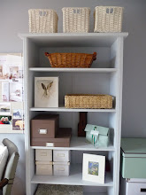
For now, I'm delighted with the colour of the furniture! It's so gentle. Once the paint was dry, I spent much of Sunday afternoon reorganizing things. The brown fabric boxes on the shelf are from Martha Stewart. They were expensive, so I waited until I got a sale coupon and picked them up for 40% off at Michael's. They are lined inside with a brown & white plaid! I use them for my stationary.

To be honest, now that the furniture is painted this soft blue, the darker blue wall colour doesn't thrill me anymore. I think a soft cream or pale linen brown would be prettier. But for now, I'll leave it as-is. I still need to paint the trim work (soon) and slipcover the armchair. Although David and I are now considering putting a chaise, small sofa, or daybed in here, so the armchair might get the boot!
I think the space looks a lot more tranquil. The little dresser (which I shall put a mirror over) holds bills and house files, and I bought some white storage boxes at Ikea. The big ones on the floor hold files and the small ones on the shelf hold jewellery and craft supplies!
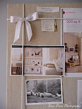
I also treated myself to a bulletin board makeover. I had bought a cheap corkboard at Michael's, and this weekend I covered it with plain brown linen from Fabricland, a relatively inexpensive fabric shop.
I used a staple gun to attach the linen to the frame at the back. I also bought some pure white braid and added trim work (and a bow!). The trim is a little feminine for my liking, but I think I'll leave it pretty for now.Now I have a home for all my inspiration pictures (which I often photocopy from magazines instead of ripping them out).
Here is the other side of the room (opposite the bookcase) which we don't have well organized (sorry the picture is kinda tilted)!

I know decorating magazines complain about displaying family photos too prominently, but I think that's rubbish - we like to see our loved ones every day (even if they're not in classy black & white)! Eventually I'd like the built-in bookcase to look more coherent, so I may re-frame a few items and style it a bit.
I also covered a small bulletin board (below, $5.99 from Ikea) with linen, for snapshots and postcards. I'm not smitten with the location, but I'm running out of walls, and it's accessible for quick changes.
Biscuit really likes the new room as he looks best in complementary colours.
I will share more with you when I attack the other end of the room. I'm now thinking about putting a cozy chair (and footstool), daybed or sofa in here, so we may remove the big table. David & I often spend time in here together, so we need a little more seating.

In the meantime:

* I must hang curtains (white cotton)
* I have big plans for the desk thanks to a suggestion from Joni at Cote de Texas
* I have to install some shelves and figure out some art work for over the desk
* See where we can fit a chair or daybed!

Stay tuned!

Monday, February 02, 2009

An Artist I Admire

My Swedish friend Poppins blogged the other day about her trip to Copenhagen where she and her husband visited the Ordrupgaard Art Gallery.  There they saw the works of many wonderful artists, including one of my favorites - Danish painter VilhelHammershøi
*
The painting above is one of my favorite works (it's of his wife Ida, at their home).  I can't quite put a finger on what quality the piece possesses that so appeals to me, but I love everything about it, from the muted colours to the decor (that gorgeous tureen) and architecture to the sense of solitude and quiet of a private moment.  Even her dress is lovely (it looks like silk).  The painting has a gentle mysterious quality that is very captivating.  Hammershøi painted a number of these quiet scenes inside his own home and often included subjects with their faces obscured.  He liked to paint empty rooms, which I find quite amusing and lovely.
*
When we were in Paris, I snapped a picture of the painting below at the Musee d'Orsay, where I was pleased to see his work in person for the first time.  This painting was also done at Strandgade 30, his home in Copenhagen.
Prints of Hammershoi's works are available at Art.com, where budget art lovers may feel right at home with no art snobs lurking about.

Sunday, February 01, 2009

~ Sneak Preview ~

I love the new colour of the dresser.  Here is some staging for the photo session (it won't look like this).  I like the colour of the brown Martha Stewart photo box.  I also bought a paper storage box from her collection some time ago.
Here's another view.  The little white porcelain horse came from the Paris flea market.  I bought the photo of the Flatiron building last time I was in NYC.
I will finish painting the bookcase today!

The colour is Sea Fog by General Paint, which is a western Canadian company.