The White House: The Kennedys' master bedroom, as designed by Sister Parish (I love this room!)
Just the other day I was flipping through my copy of "Parish-Hadley: Sixty Years of American Design." If you don't know them, Sister Parish and Albert Hadley were influential and successful American interior designers who operated a prominent Manhattan firm from 1962-1999. Sister Parish died in 1994, but Mr.Hadley, as far as I know, is still busy designing in New York after closing down the Parish-Hadley firm. I don't know much about him (other than he was quite a modernist, didn't like too many doo-dads in a room, taught at the Parsons School and came from middle class Tennessee, where he took an interest in design as a boy), but I have actually read a fair amount about her. She was a socialite on the New York social register and had a heck of an eye for design but no formal training. For some reason, she strikes me as an interesting lady. By the way, Jackie Kennedy hired her to re-decorate some rooms of the White House, and Mrs. Parish was the first professional interior designer to do so.
Anyway, I won't pretend that I have studied them exhaustively, but I have pored over my copy of the Parish-Hadley book and read a lot about her. I love studying earlier design to see how things have changed and what's remained the same. It's funny, but if you study old rooms you will see that they've changed enormously (often less busy and fewer patterns) but they are also shockingly the same.


This isn't meant to be a long comparative essay (as much fun as that would be!). Instead, I thought I would throw together a quick post showing some neat things I noticed in the Parish-Hadley book that struck me as interesting or quirky:
Here is a lovely example of a quatrefoil motif, in this case, used on a pair of mirrors. This motif is back in fashion. Notice also the bird cage (house), which looks familiar. And apparently blue and white Asian bowls never go out of style.
The next observation pertains to the placement of side tables and night tables. I noticed several rooms in the book where side/night tables are placed lengthwise, parallel to the bed, as opposed to sitting at 90 degrees to it. Refer to the White House photo (top) where both night tables sit parallel to the bed.
In the photo below, a Lucite table (very familiar in contemporary decor!) sits adjacent to the chaise, lengthwise, in an arrangement we would likely not use today. Sorry for the bad image as you can barely see the see-thru table (it has the giant plant on it). Note also her quirky pillow arrangement (two pillows at angles).
 Below, the little baroque night table also sits parallel to the bed. It seems so odd, but isn't it more practical? Everything is within easy reach!
 Below the night tables are in their proper spots (at least by our standards), but I love the addition of a chair beside the bed for holding a pile of books. I always had a chair piled with books at my parents' home because my night table was too small - I had totally forgotten about it until I saw this photo. What a marvellous and practical idea.
 Another sideways table below. Check out the wallpaper, baby. I can see how this era gave birth to psychedelic drugs. Still, I think the day bed (and similar armchair) is gorgeous...
 I included in the image below purely for the colour scheme. This is a very BUSY room (they say Sister Parish was not afraid to pack a LOT of furniture into a room), but I liked the glazed aubergine walls (which look chocolate brown in the book) with the pink drapes. If it wasn't quite so busy, these colours (hot pink, orange, pale pink, brown) remind me of a Domino spread. Notice again the funny arrangement of pillows on the chaise.
 The next photo I included for its sunburst mirror - they weren't invented yesterday darlings. I also noticed the ubiquitous flowering quince (by the window to the right, mostly out of the shot), so this isn't new. In fact, there were flowers in almost every room in the book! Apart from the dated brown rug, this room could have been done yesterday.
 Hope you've enjoyed this walk down memory lane. It is a sublime treat to drop by the library and pick up old decorating books and study the masters. There is so much to be learned, about what to do and what not to do!
 Below, the little baroque night table also sits parallel to the bed. It seems so odd, but isn't it more practical? Everything is within easy reach!
 Below the night tables are in their proper spots (at least by our standards), but I love the addition of a chair beside the bed for holding a pile of books. I always had a chair piled with books at my parents' home because my night table was too small - I had totally forgotten about it until I saw this photo. What a marvellous and practical idea.
 Another sideways table below. Check out the wallpaper, baby. I can see how this era gave birth to psychedelic drugs. Still, I think the day bed (and similar armchair) is gorgeous...
 I included in the image below purely for the colour scheme. This is a very BUSY room (they say Sister Parish was not afraid to pack a LOT of furniture into a room), but I liked the glazed aubergine walls (which look chocolate brown in the book) with the pink drapes. If it wasn't quite so busy, these colours (hot pink, orange, pale pink, brown) remind me of a Domino spread. Notice again the funny arrangement of pillows on the chaise.
 The next photo I included for its sunburst mirror - they weren't invented yesterday darlings. I also noticed the ubiquitous flowering quince (by the window to the right, mostly out of the shot), so this isn't new. In fact, there were flowers in almost every room in the book! Apart from the dated brown rug, this room could have been done yesterday.
 Hope you've enjoyed this walk down memory lane. It is a sublime treat to drop by the library and pick up old decorating books and study the masters. There is so much to be learned, about what to do and what not to do!


 posing...


 I also treated myself to a
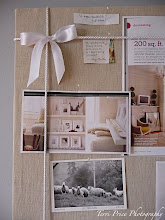
 Now I have a home for all my inspiration pictures (which I often photocopy from magazines instead of ripping them out).

 Biscuit really likes the new room as he looks best in complementary colours.


 This space is the perfect incarnation of the colours I want in my home office. There is the blue and white theme, accented by striped brown and white blinds (I intend to use linen-coloured fabric) and little pops of pink and green and turquoise.
 I emptied the drawers and took it apart, removing the old hardware (which I'll replace).