

A coastal home in Virginia:
Entrance hall painted in Benjamin Moore's Hazy Skies (OC-48) with Acadia White (OC-38) trim.
I've just come across a lovely coastal home in Chesapeake Bay, Virginia, featured in a past issue of Coastal Living. This gracious home encapsulates a colour palette I've been considering for a while...you see, I've been smitten with the notion of painting my main floor (dining and living rooms) blue! And I'd like to carry the blue into the rest of the house, along with lots of white and touches of linen brown (at least this week...)
Currently, our whole main floor (living, dining, foyer, 2 stairwells and upstairs/downstairs hallways) are a pretty chartreuse-green colour, which is warm and inviting. But the walls have a lot of nicks and chips and need a fresh coat. So, why not try something new?
But I'm struggling with this blue concept, since blue can be a little cold if you don't choose the perfect one. And I don't have an ocean outside my window for context (and to make it entirely unnoticeable). My living and dining rooms (not to mention the foyer) are naturally what one sees when one opens the front door, so I want these rooms to be as welcoming and warm as possible. Luckily, the foyer and living room face south, so the whole space gets tons of natural light. My furniture is sage green (and the new rug is beige and blue and green), so it's already a warm-enough space. But the existing greens are so inviting and cozy that I'm afraid to change. So I'm tempted to be a bore and repaint in the original colour or do a greenish version of blue.
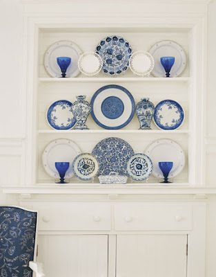
But I'm so fond of those gentle pale blues, as shown in the living room and dining rooms below:

 Living and dining room in Benjamin Moore's Woodlawn Blue (HC-147) with trim in Acadia White (OC-38)
In these rooms, I also like the use of those linen browns and whites with small dashes of brighter complementary colours. I love this combination and it seems a natural fit for our house since the downstairs (family room floor) already has lots of brown (a brick fireplace, wood library panels, off-white berber, brown linoleum in the hall, taupe walls, brown linen curtains, etc.)
If I go with blue on the main floor, I'd prefer a different colour for the two stairwells and hallways that lead to the other two floors. For these, I'm considering ivory (like my master bedroom, which is White Down from Benjamin Moore). But I also like the idea of a warm pale brown (like Maritime White by Benjamin Moore, which is a beautiful milky coffee-ish colour) or perhaps a greige/grey colour, like that shown in the main entrance (first photo above) and the landing below:

 I really adore the pale blue, white, light brown scheme in this house. I find it oh-so-soothing but would definitely need to spice things up a little with some brighter colours. I happen to love pink, but I also like the whimsical guest room below, in which they've used fresh oranges and corals and such, a perfect foil to the nautical blues and whites.
I think the possibilities are endless here, don't you? Now, if I can only stop changing my mind long enough to paint...


 I understand that it must be nigh impossible for designers to work with lots of existing furniture and accessories and still create their sleek rooms. I get that it’s sometimes easier to wipe the slate clean, or to pick a couple of favourite things and work from there. Putting together these rooms must take months of hard searching and coordinating and is nearly as complicated as open-heart surgery, so I respect the effort. But still, the rooms can seem a little too perfect. Like eating too much candy.
 When she does contemporary interiors, she injects lots of classic details to make the rooms less functional-looking (i.e. plain), and when she does traditional, she likes to
  Her work is definitely for the horsey set and is quite serious, not like the whimsical eclectic rooms you see in
  All the photos I've included are her work, from Architectural Digest. There’s also a wonderful feature on her


 This weekend we had David's family over for dinner. I always use the arrival of guests as an excuse to buy flowers (I rarely need an excuse). The flowers are miniature carnations, which I adore. They are the definition of pretty!
 I've already ordered the Rosedale, so my lamp will look like this, except with a shiny chrome base. I've chosen the pure white shade which has a heavenly glow!


 Ryland Peters & Small is a UK-based publishing house which produces the most exquisitely lovely books on interior design, as well as lifestyle subjects like food and drink, gardening, body and soul, and babies! They have awfully pretty wedding books too. But mostly, I am smitten with their interiors...
 The photos in the decor books are simply stunning, beautifully styled and perfectly-lit. All the photos appear to have been taken on a fine spring morning in the prettiest homes in England. Clear, natural light streams into the rooms...
 These books are definitely the beautiful people of the publishing world. But while the architecture and character of many of the homes is sublime, the decors are not always expensive. They often appear to be more found style and slowly acquired, rooms that you cultivate over the years...
 I adore these books! I've borrowed many at my library, and have even invested in a few of my favorites. If you're a serious decor junkie, you've likely already seen a few of their titles, and some of their famous photos (many of which are recycled in several of the books). I guarantee that everyone has seen at least one shabby chic photo from their The Relaxed Home book!
 I know you will have some lovely moments with these books. But I cannot be held responsible if you fall madly in love and cannot look at another decor book again...


