
Today, I visited Maria Tomas, the only Farrow & Ball retailer here in Calgary (luckily a few blocks from my office) to view the new colours.
I was positively smitten with several of the colours and especially loved the first eight, which I've included below:

There's a new white (No.239 Wimborne White), an elegant tan (No.240 Cat's Paw), and my three favorites: a creamy stone off-white (No.241 Skimming Stone), a noble light gray-blue (No.242 Pavillion Gray), and a refined dark gray-brown (No.243 Charleston Gray).
I've also shown a handsome dark brown (No.244 London Clay) which looks beautiful next to a pretty pale pink (No.245 Middleton Pink) and a gorgeous dark rose (No.246 Cinder Rose). I've been dying for rose to come 'round again!
You could steal this palette alone and design a whole house (minus the tan, perhaps!).
Check out the remaining 10 colours at Farrow & Ball.
All paints are made at the Farrow & Ball factory in Dorset, England. The company is renowned for using "more high quality pigment in every tin than any other manufacturer." Since all paints are factory-blended and quality-controlled, colour accuracy is assured. In other words, no blending is done at your neighborhood shop!
Sophisticated designers rave about paint, but it's a rather expensive at over $80/gallon here in Canada (which is about $20 per gallon more expensive than Benjamin Moore's top-of-the-line paint). The paint is supposedly a little finicky to apply as well, so a confident painter and good instructions are a plus!
I can't wait to try a gallon for myself, perhaps Pavillion Gray, my new favorite hue!


Hi Terri, just popping in to say hello. I'm a little behind on reading blogs, but I will definitely be back to see what you've been up to. Hope all is well and that you have a great day!
ReplyDeleteOf all those colors, I'm most drawn to the pavillion gray myself. I can tell that you're gearing up for some big changes!
ReplyDeleteFarrow & Ball....wonderful paint! I have a sample pot of 'Pointing' which I am thinking about using on my kitchen walls. I currently have wallpaper, which is in bad shape, but I feel the task of taking it down is a bit daunting!
ReplyDeleteI took the 'Austen Heroine' quiz, and I am Elinor Dashwood! That was fun.
Oooh, I love that dark brown with the dusty rose. Your life has been full of rich colour lately! I wish you a wonderful birthday week and look forward to more life and home decor updates.
ReplyDeleteI love the new Pavillion Gray. Let us know how it looks.
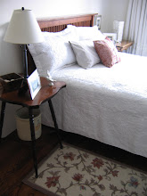
ReplyDeleteWow! The lamps in that first pic SPEAK TO ME!!!! Love that you broaden my horizons. I just may need you to take me to PB (I have never been).
ReplyDeletea
I didn't realize they deleted some colors - I wonder which ones - do you know?
ReplyDeleteJoni
I just put pavilion Gray on my kitchen walls surrounded by high gloss white cabinets. its very pretty
ReplyDeleteFarrow & Ball has always had a marvelous colour palette. So sophisticated without being pretentious.
ReplyDeleteIs this a paid theme or did you modify it yourself?
ReplyDeleteWe are a team of volunteers and starting a new project
ReplyDeleteOh I hope you really enjoy yourself and your family!
ReplyDeleteThis sharing concept is a good way to enhance the knowledge.
ReplyDeleteIt’s very interesting, I advise everyone buy essay who is interested in writing an essay
ReplyDeleteI will be sure to bookmark your blog and definitely will come back sometime soon.
ReplyDeleteThank for making and spending your precious time for this useful information.
ReplyDeleteInteresting thoughtss
ReplyDeleteCzy kiedykolwiek rozważałeś napisanie e-booka lub gościnne pisanie na innych stronach internetowych? Prowadzę bloga opartego na tych samych tematach, które omawiasz i naprawdę chciałbym, abyś podzielił się kilkoma historiami / informacjami. Wiem, że moi odbiorcy doceniliby twoją pracę. Jeśli jesteś zainteresowany, napisz do mnie.
ReplyDelete