Wednesday, March 04, 2009

New Decorating Crush: Brown!

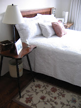
The other day, I posted about this new brown lampshade:  
When I came home with it, I couldn't figure out how my usual overpowering need for white and otherwise light, airy colours was displaced by the need for something...brown.  

Brown, after all, is not my favorite colour.  And moreover, since it's spring (well, not in Canada anyway), you'd think I would have yellow or pink on my mind instead of dusty old brown.  But somehow, brown had worked its ubiquitous brown self into my head and I was seeing it everywhere!

If you asked me two weeks ago, I would have said that yes, I like brown, but in the form of pale linen browns, milky cafe au lait browns and dark brown furniture.  Period.  And other than those light shades, it would not have figured in my decor.

So I came home and looked through my files and realized that I had quietly developed a brown fixation in the last two weeks while looking at the rooms of James Michael Howard (see my previous post here).  His rooms feature some very serious browns (usually combined with white or light-coloured rooms), and I had fallen for this image specifically, with its elegant brown and white platters:
And then there was the brown and cream rug in this photo (below), which caught my eye for its elegant pattern and perfect brown-ness (I like these medium browns best).  And it looks so great with all the blue and white (my two favorite colours) and really grounds all that airiness. 
Then, there was the simple photo (below) that Catherine posted on her beautiful blog Simply Natural a short while ago.  I saved this picture and clearly the decorating part of my brain processed this image while the rest of me was asleep, because I did not consciously notice this brown lampshade until tonight!  I had liked the image simply because it reminded me of the colouring of Jim Howard's rooms and possessed the same quiet grace and inviting quality.
Then today at the office, I started daydreaming about the exquisite Gien earthenware I'd seen at Printemps in Paris (and have regretted not buying ever since).  I fell in love with the country images and the pretty browns and whites.  From their website, it appears they deliver!  I was mad about the tureen but cannot justify the price! 


And then I went through my files and found many brown and white rooms, proving that my unconscious mind has been way ahead of me for a while.  
The following two photos are from House to Home:  
I now notice the brown and white pillows but saved the photo originally for the linen curtains, white walls, and rustic styling!
Then this week Michele at My Notting Hill posted some exquisite photos of a Paris apartment (from this site) and I was smitten with the brown and white pillows on the bed (below).  These gentle brown and white pillows, combined with the white walls and blue bed are heavenly!

I think the combination of brown and white is the best way to use brown...
And here is another brown and white room, in a photo from OKA Direct, who have stunning rooms in their catalogue:
And then there are these two wonderful sofas from Restoration Hardware.  Note the conspicuously brown colour that my all-white-obsessed brain had deceptively admired.
Another perfect example of brown and white together, in this Shoot Factory picture:

The Lesson:

I've realized that not everything in a light and airy room needs to be light-coloured. Dark colours like brown, when used as accents, help to ground the rooms and actually highlight the light colours.  I can't believe it took me this long to learn this simple and obvious lesson!  I won't be painting my walls brown any time soon, but you can be sure I'll be bringing a few more brown accessories into my home!

I guess the Buddhists are right when they say that happiness (or is that enlightenment?) lies within.  All you need to do is pay attention.  The browns were there all along - I just wasn't seeing them with my heart. 
 ******
And if you still need proof, this room from Traditional Home proves that brown can be very, very sophisticated, especially when paired with the finest creams and white!

Sunday, March 01, 2009

The Lucite bandwagon

It takes me a while to come 'round to a trend.   I'm not exactly an edgy decorator, mostly because I prefer historical, classic looks - lots of white and ivory, antiques, and old-fashioned objects and art. 

Which brings me to Lucite!  I've admired Lucite lamps for a while and finally jumped on the bandwagon (rather late, I'm afraid).  But it occured to me that this look is pretty classic, and if you choose the right style, it doesn't look too trendy.  
I found this beautiful (affordable) lamp yesterday at Home Sense and put it on my living room console table, along with a large mirror I've had for a while.  The mirror is leaning now, but will eventually be hung!
The lamp arrived with a white shade, which I switched to a chocolate brown shade instead.  I knew the brown would help ground my composition, which is rather light with its shiny, mirrored, and silver elements. 

For your edification, Lucite is a trade name for a plastic called polymethylmethacrylate (PMMA), which is the same material used in Plexiglas (also a trade name).  PMMA is an acrylic plastic (there are many different acrylics).  It is a hard, tough plastic known for its excellent clarity (it replaces glass), but it does scratch easily.

P.S.  Did you forget I have a masters degree in polymers and plastics?
While I was shopping, I also picked up frames for three antique etchings I bought at the Paris flea market (St-Ouen).  The etchings were purchased from a veritable art dealer and were not cheap.  They date to the late 1800's and the paper is very fragile.  I plan to have them professionally framed (archival mats and UV glass) when my favorite frame shop has its annual sale.
The first picture shows a palace celebration while the second shows La Bourse, the stock market building in Paris, which has classical Greek architecture.  The third etching (a vertical) is not shown.

The two photos below show the lamp with its original white shade.
I don't mind the white shade but prefer a slightly rounder shape.  What do you think?
Below is another etching in my small collection.  I threw this photo in because it's one of my favorite things and was the inspiration for the other purchases. 
It shows a lady and a suitor and says "A Bientot" ('til we meet again).   

I had it professionally framed, which cost a lot more than the actual etching, which I found in a junk/antique shop in a big pile on the floor!  I rescued it for $10 and regret that I didn't buy more, as it cleaned up very well.  It hangs in our front entrance.

Tuesday, February 24, 2009

The Acquisition of Things

A favorite bedroom from designer Christopher Maya

As a person who loves to decorate and adorn my home, I'm always balancing my wishes with my pocketbook.  I hate settling for anything less than perfect, but I frequently do.  Generally, availability is the problem.  There is a less than stellar selection of wares in Calgary (especially if you have traditional tastes) and if you ever want your home to be remotely attractive, eventually you must pick from the available offerings.  Or you keep living with that Ikea coffee table in your otherwise polished living room. 

And lest we forget the bigger issue - the question of cost.  I covet fine things, but just how much is too much to spend on a given object?  
A simply appointed hallway (with Burberry umbrella, no less) by designer Christopher Maya

I know many people quote William Morris's "have nothing in your house that you do not know to be useful or believe to be beautiful".  While I agree wholeheartedly with his quote, the reality is that I cannot afford what I find most beautiful, generally. 

And while this is wonderful in theory (and perhaps a great shopping mantra to prevent too much junk from accumulating in your home), it is nearly impossible to put into practice, unless you have infinite time, resources, patience and access to products (by living in a large and cultivated American city for example, like some lucky so-and-so's who shall remain unnamed).

So I find my poor self continually settling.  In our house, I can probably name less than 10 things that, if pressed, I would say I truly adore.  Everything else is adequate:  I may like it, be fond of it, or have nostalgia for it, but I don't love it.  Perhaps if I were into flea market chic I'd be easier to please.  Or perhaps the quote would be easier to put into practice if I were born with the deep pockets of a Rockefeller or an Astor? 

The reality for most decorators of modest means, specific tastes, and limited access is compromise.  Unless of course you are the martyr purist willing to live a life of eternal waiting with your few precious gems for the arrival of that perfect object of lust.  I envy you your strength and patience!
Just the other day, I came up against another contest of want versus wallet.  I spent $270 on window hardware from Restoration Hardware (where you pay for character, if not quality) for our dining room (that's for a 48-72" rod, two brackets, 14 rings, and two end caps!).  When I think of beautiful homes I admire, this is a drop in the bucket compared to what many spend to create a blissful and considered environment.

David and I can afford this splurge, financially-speaking.  But I don't want to afford it, spiritually and practically.  I am a die-hard saver and feel sick spending $270 on a curtain rod.  Naturally, it is impossible to find a shiny nickel rod anywhere in Calgary for anything less than this amount.  Trust me, I've tried.  At the custom drapery shops, and the price point was $300 minimum.

In the long run, this isn't much to spend to make a beautiful window, considering I bought the silk panels on sale.  But the reality is, for $50-100 I can buy an inexpensive rod that while mediocre, will do the trick.  It's not like my home will be in House Beautiful any time soon, so who will notice?  And I can put the $300 towards a coffee table that people will notice, something that actually matters, in terms of form and function.

But the dilemma arises because I don't want to settle.  Yet I don't want to waste money either.  I prefer to spend my money to pay down our mortgage, save for renovations, or buy good furniture.  For me, good furniture is most important decor-wise. I also prefer wool rugs (I cannot pretend to afford silk) and good bedding.  Art is important too, but lovely works can be had for a modest budget.  For everything else, I am flexible (which means cheap).  

What I wonder is, do you also struggle with where to spend your decorating budget?  Do you do the same balancing act, whether your budget is large or small?  In the annual Acquisition of Things, what do you spend your money on?  Where, or at what cost, do you draw the line?  What can you justify spending big bucks on? What do you insist on buying cheaply? 

Do tell! 

In a future post, I will explore the places I've found to save money (so I can even consider splurging on preposterous hardware for my windows!)

Sunday, February 22, 2009

Introducing The Howards

My favorite hallway/stairwell ever from James Michael Howard.  I saw this photo recently (here) on one of my favorite blogs, Things That Inspire, who I credit for introducing me to Mr. Howard!

In my last post, I talked about the dining room at Jim & Phoebe Howard's house in Jacksonville.  Jim Howard is the interior designer behind James Michael Howard Interiors, while his wife Phoebe is an accomplished decorator and shop keeper. Together they run the Mrs. Howard and Max & Company growing chain of stores (with locations in Jacksonville, Jacksonville Beach, Atlanta, and soon-to-be Charlotte).

I was going to post about Mr. Howard, whose website is rife with pictures of stunning rooms, all with lovely architecture and a quiet, historical style that reaches straight to my heart.  But the more I investigated the pair, the more I realized that Mrs. Howard often has a hand in the decoration of the rooms.  Without knowing them or spending hours decipering rooms, I cannot really separate which rooms are strictly his, which are hers, or which they did together.

What I did notice was that her style is more colourful and vibrant (at least according to the articles featuring her work alone) whereas his rooms (from his site) appear considerably more sedate.

There is no use trying to distinguish at this point.  So for now, I shall show you some rooms featured on his site, because I love so many of them.

Above: The exquisitely arranged hallway in their Atlanta apartment.  I would like to bring everything here home.  Mrs. Howard is attributed as having decorated this apartment whilst Mr. Howard looked after the architecture and interior layout.  I love the console table, the baroque mirror, the X-bench, the pair of Lucite lamps, and even the brown rug.  The walls are a greyish-blue called "Blue Hubbard" by Sherwin-Williams.

Above: The front entrance at the couple's Jacksonville riverfront home, in the historical Ortega neighborhood.


Above: A quiet and lovely transition space.  I like the use of neutrals, graceful antiques and small works of art, all in slightly different frames, for a collected-over-time feel.


Above:  A welcoming neutral bedroom (seen first on Things That Inspire, I believe).  In addition to soft browns and creams, the couple like to use pale blues.  They get my vote for their gentle colour schemes!  Again, note the glass/lucite lamp, a common feature in their rooms.

Above:  The other side of the same bedroom, almost perfectly symmetrical.

Above: I believe this is the bedroom in their Atlanta apartment.  The graceful armoire likely holds a television.  Isn't the chaise pretty?  If I lived here, I would lounge around all day feeling smug and self-satisfied.


Above:  I think this shot might be from one of their stores, but I'm not entirely certain.


Above:  This room, designed by the couple, is from the 2007 Atlanta summer showhouse.  What I like most here is the sepia-toned map of London.


Above: Another pleasing vignette with a Gustavian feel.


Above:  A gracious living room with vaulted ceiling and herringbone-tiled fireplace.  Things That Inspire posted a lovely photo essay about herringbone fireplaces here.

Another architectural detail from Mr. Howard's site.  I first saw this image on Things That Inspire. Thanks again TTI!

Above:  This exquisite living room is in the couple's Atlanta apartment.  Again, note the architectural detail, the soft neutral palette, and the use of varied antiques.  I like the simple sofa, which I believe is Danish modern.  The coffee table is rosewood.

Above:  Another pretty bedroom, in the usual colours.  Note the ubiquitous sunburst mirror and Lucite lamp.  The mirrored night table is a surprising bit of glamour.  Things That Inspire posted a beautiful feature on sunburst mirrors here.

Above: The Howard's dining room in Jacksonville, with a stunning Federal mirror and a pair of knife boxes.
Above: Another pretty passageway with a pretty brown and blue rug and what appears to be a marble-topped table.
Above: I love this vignette with its delightful display of platters.

Above: I am not terribly fond of the dark stone sink, but this mirror is to die for, darlings.  Notice also the lantern in the bathroom (reflected), a favorite fixture of Mr. Howard (and moi).

A dining room vignette (above and below), with a surprisingly modern twist.  The modern painting and styling surprised me, but I think it is quite elegant and livens up the otherwise staid room.

Above: A darling and utterly classic tiered bathroom cabinet holds plush towels.

Above: Another pretty bedroom vignette with a contemporary art work.  I am not sure of the style of this dresser, but think it might be Georgian.
Above: A very posh bedroom belies Mr. Howard's generally restrained tastes.  I think Mrs. Howard may have got her hands on this one.  Thankfully they placed a bench at the end of the bed and not the ubiquitous sofa he seems to be so fond of (a look which I dislike, sorry to say...see below!)


Above: A darling urban bedroom, but I could do without the sofa at the end of the bed.  This is a look I really dislike but which Mr. Howard seems to enjoy.  It just looks too smooshed together for me.  Otherwise, he is perfect in my book.  Perfect!  But what do I know - I didn't go to the Parsons School, now did I?

Above: The refined dining area in their Atlanta apartment.  I love the pale blue-grey velvet upholstery on the dining chairs.  The banquette seating is versatile for working and lounging.  This apartment is like being inside a cloud.

Above: One last bedroom, with Jacobean-style bed, a lofty ceiling and a cool palette.

I hope you've enjoyed the tour and please forgive any errors as I am just beginning to learn about the Howards and intend to study their styles more fully.  I have a huge design crush on this illustrious pair.  Oh, and they have a daughter who is a chemical engineer like me!  More reasons to feel kindred!

Thursday, February 19, 2009

My Favorite Room Ever (by Mr. & Mrs.Howard)!

I think this is my favorite room ever. I've collected many photographs of beautiful rooms over the past 2 years as I've been seriously indulging my love of decoration. But this room takes home the blue ribbon.

I first discovered this room in a book I bought called "Easy Elegance", a compilation of elegant rooms from Traditional Home. I have looked at this book a thousand times and each time I sit and admire this room and its quiet elegance.

I'm not sure what quality it possesses that captures my heart most, but the combination seems to sum up my tastes. It's the creamy white walls, the pale blue-grey (?) drapes, the classic mahogany furniture, and the crisp slip-covered chairs. I love the perfect, simple and elegant chandelier, the hurricanes with their white candles, the exquisitely clean architecture (dentil moulding, be still my heart), and the beautiful landscape painting. On the walls, there are antique mercury glass candle sconces that are two of the most beautiful things I've ever seen. I love the "H" monograms on the slipcovered chairs. I love the rug. I love everything! Looking at this room is like staring into heaven. Can you imagine a dinner party here?

This room speaks my language. It says that I'm a traditionalist and that I love simple elegance and lots of white and pale colours (but you knew that already).

So, you can imagine my surprise when I visited the website of James Michael Howard (after a tip from my friend at the lovely blog Things That Inspire) and discovered this room!  My room!  I was aware of the beautiful work of decorator and beauty purveyor Phoebe Howard (who owns the store "Mrs. Howard", among others), but did not realize that her husband, Jim Howard, was the accomplished interior designer behind the interior design company "James Michael Howard".

(I always considered myself a bright person, but sometimes it takes me a while).

When I realized that designer James Michael Howard was in fact Mr. Howard (the other half of the famous Mrs. Howard), and that it is their room I've been loving, I was gobsmacked. As I looked through his site (for about 2 hours whilst at the office supposedly working!), I came across several other favorite rooms I'd seen and loved before.

So, not only have I discovered that my favorite room (above) was designed by the Howards, but that it's in their own riverside home in Jacksonville, Florida. I'm terribly excited by this fact because I finally have a context for this beautiful room. And I think I have a new favorite designer, Mr. Howard, judging by the beautiful, quiet spaces on his website. It's like all the stars have aligned in the universe.

Now I have a major design crush.

I will post some of my favorite rooms by Mr. Howard this weekend. He is my new interior design icon. And do check out his wife's exquisite site Mrs. Howard, which features her amazing body of work, their combined projects, and various rooms from their now-famous shops.

Perhaps a trip to Jacksonville (or Atlanta) is in order? I might need an autograph!

Sunday, February 15, 2009

Office: Desk Reveal!

Last week I blogged about the ugly table I'm using for my office desk. I made lofty plans to cover it with fabric and glass, thanks to a suggestion from Joni at Cote de Texas.

I'm sorry to disappoint, but I didn't do as fancy a treatment as I'd planned. I decided it didn't make sense to bring the fabric across the front. As some of you mentioned, it wouldn't look very nice with the chair pushed in. And also, it would require a center pleat for sitting.

That was enough to discourage me. I wanted something simple that didn't cost a small fortune. My tailor is a posh dressmaker and could make anything, but I really didn't want the cost of fancy pleats. So I got her to do a simple hem (after she serged it). I love the way it looks but think I might bring the near-end all the way to the floor.

I bought 3m of plain linen for half price (about $35 total), did my measurements and took it to the tailor (who charged $20). I got glass cut the same day for $108. I did not get a bevelled edge (which cost $50 more). It is simply sanded round at the edge.
Biscuit really enjoys the fabric and likes to hide behind it.
I decided not to iron the linen. The tailor gave it a quick press, but I prefer the wrinkles!

I was so excited to get it all together but was shocked to find that my mouse doesn't work on glass! It needs a mouse pad now.

Here's the other side of the room:

I haven't decided what to do here. We sorely need some office storage but don't want to spend any new money! The table is great for holding things and for projects, but I hate the clutter that accumulates there and really need some file storage. Please ignore my ugly black shredder under the table (I should have moved it for the photo - bad stylist that I am!)
So I'm thinking of putting a chaise here and perhaps a tall cabinet near the window for storage. For now, it suffices and I've styled it with recycled art. I love this pheasant print by wildlife artist M.G.Loates which I bought it at a church auction for $10 (and will eventually re-frame).
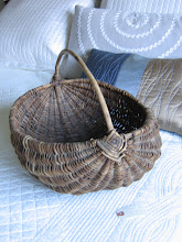
The basket is for electronic stuff like iPods, cords, chargers, and cameras (I put a soft cloth at the bottom).

I still have to install curtains and some shelves over the desk. I toured Home Depot yesterday but they had a terrible selection of shelves (actually plenty of shelves but very ugly brackets), so I will check Ikea. More soon...!