Showing posts with label pale palette. Show all posts

Friday, May 08, 2009

Spare Bedroom ~ Inspiration Found!

Thank heaven Spring is here to cheer me up with its bright, long days and budding green-ness.  I really needed a pick-me-up and the weather (and gardening season) is lifting my spirits.

In typical Spring fashion, decorating dreams begin to unfurl and the list of projects grows in my head.  The room that's been on my "to do" list is our downstairs spare bedroom.  I will post photos soon, but suffice it to say this is a favorite room, very small and cozy (10'x10'), with tall built-in bookcases, a big shaded window and a large closet.  It's very cool in summer for sleeping and we've actually grown accustomed to sleeping here more and more of the year!  There is something charming about a small, breezy room.

The room is very plain Jane right now and really needs some decor-love.

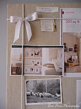
So in an effort to kick-start the process, I've compiled a few of my recent favorite inspiration photos here.  

If you've visited me before, you know I'm a fan of graceful, cool neutrals and soft grey blues.  I want this room to evoke one word:  SERENITY
  
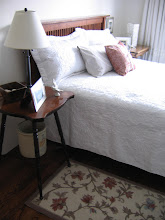
I love the neutral walls above, but I'm considering painting the room blue (Farrow & Ball's Skylight) and using all white, cream and taupe accents.  If you recall, I bought a splendid Laura Ashley quilt (below) in Paris last Fall, as well as the little pillow at BHV in Paris.  I would like to use them both:
I also love the tranquil colours in the photo below.  The wall colour is Farrow & Ball's Pavilion Gray, which is a little too somber for me.  But I love the room's tranquility and many of the details, including the blue-gray roman shade with the striped trim:
In the furniture department, I'd love an upholstered headboard, but cannot find one that meets my specifications.  And I'd prefer to orient the bed under the window anyway, which leaves me restricted on headboard height (43").  After an exhausting search, I found this modest bed from Ikea (Vanvik), which has a low headboard and is very cost-conscious.  I plan to go see it tomorrow and pray it's suitable.
Ikea also has a Hemnes four-poster bed that caught my eye.  It does not appear to be available in white, so would require a paint job.  I don't know if the room's proportions would accomodate a four-poster, but it might enhance the nest-like quality, don't you think?  I love the idea of draping pretty fabric over the top, like this:  
Or even better...this pretty floral fabric:
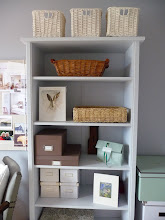
The room has built-in bookshelves across one entire wall.  I would love to paint the interior a contrasting colour (perhaps white) and have been considering wallpapering the back wall of the bookcases.  But since it is built-in, it would be a sheer torture to cut and wallpaper all 24 cubbies.  If you've ever painted a bookcase, you'll know that painting the 24 shelves/cubbies will be bad enough!  But wouldn't this pretty damask paper look nice in the room?  
Perhaps I will just have to do a single panel to hang somewhere (not that I can afford F&B wallpaper, which requires a minimum two-roll purchase at the one available dealer in Calgary).
*
Besides damask, I also really love this striped fabric from the beautiful and gracious Windsor Smith. She has a gorgeous, sophisticated fabric line, and I like the versatility of this stripe, perhaps for a roman blind:
Or maybe I could paint stripes on the back wall of my bookshelves?  Ah...I can see there is a lotta, lotta work to do!

Here is a Parisien inspiration room with peaceful colours, published by My Notting Hill:
I also love the photo below (the romance, the colours), but can't see myself under a gauzy coronet every night.  Perhaps in my dreams....
I will post photos of the room when I get ready to paint in a couple of weeks.  In the meantime, I am busy pondering the infinite variations on my theme.
*
Photo credits: 1.David Oliver   2.UK Homes & Gardens   3.Our house   4.Eric Piasecki photographer
  5. Ikea   6&7 Living Etc.  8.Farrow & Ball website   9.Windsor Smith Home   10. My Notting Hill photo   11. Unknown UK magazine

Sunday, February 22, 2009

Introducing The Howards

My favorite hallway/stairwell ever from James Michael Howard.  I saw this photo recently (here) on one of my favorite blogs, Things That Inspire, who I credit for introducing me to Mr. Howard!

In my last post, I talked about the dining room at Jim & Phoebe Howard's house in Jacksonville.  Jim Howard is the interior designer behind James Michael Howard Interiors, while his wife Phoebe is an accomplished decorator and shop keeper. Together they run the Mrs. Howard and Max & Company growing chain of stores (with locations in Jacksonville, Jacksonville Beach, Atlanta, and soon-to-be Charlotte).

I was going to post about Mr. Howard, whose website is rife with pictures of stunning rooms, all with lovely architecture and a quiet, historical style that reaches straight to my heart.  But the more I investigated the pair, the more I realized that Mrs. Howard often has a hand in the decoration of the rooms.  Without knowing them or spending hours decipering rooms, I cannot really separate which rooms are strictly his, which are hers, or which they did together.

What I did notice was that her style is more colourful and vibrant (at least according to the articles featuring her work alone) whereas his rooms (from his site) appear considerably more sedate.

There is no use trying to distinguish at this point.  So for now, I shall show you some rooms featured on his site, because I love so many of them.

Above: The exquisitely arranged hallway in their Atlanta apartment.  I would like to bring everything here home.  Mrs. Howard is attributed as having decorated this apartment whilst Mr. Howard looked after the architecture and interior layout.  I love the console table, the baroque mirror, the X-bench, the pair of Lucite lamps, and even the brown rug.  The walls are a greyish-blue called "Blue Hubbard" by Sherwin-Williams.

Above: The front entrance at the couple's Jacksonville riverfront home, in the historical Ortega neighborhood.


Above: A quiet and lovely transition space.  I like the use of neutrals, graceful antiques and small works of art, all in slightly different frames, for a collected-over-time feel.


Above:  A welcoming neutral bedroom (seen first on Things That Inspire, I believe).  In addition to soft browns and creams, the couple like to use pale blues.  They get my vote for their gentle colour schemes!  Again, note the glass/lucite lamp, a common feature in their rooms.

Above:  The other side of the same bedroom, almost perfectly symmetrical.

Above: I believe this is the bedroom in their Atlanta apartment.  The graceful armoire likely holds a television.  Isn't the chaise pretty?  If I lived here, I would lounge around all day feeling smug and self-satisfied.


Above:  I think this shot might be from one of their stores, but I'm not entirely certain.


Above:  This room, designed by the couple, is from the 2007 Atlanta summer showhouse.  What I like most here is the sepia-toned map of London.


Above: Another pleasing vignette with a Gustavian feel.


Above:  A gracious living room with vaulted ceiling and herringbone-tiled fireplace.  Things That Inspire posted a lovely photo essay about herringbone fireplaces here.

Another architectural detail from Mr. Howard's site.  I first saw this image on Things That Inspire. Thanks again TTI!

Above:  This exquisite living room is in the couple's Atlanta apartment.  Again, note the architectural detail, the soft neutral palette, and the use of varied antiques.  I like the simple sofa, which I believe is Danish modern.  The coffee table is rosewood.

Above:  Another pretty bedroom, in the usual colours.  Note the ubiquitous sunburst mirror and Lucite lamp.  The mirrored night table is a surprising bit of glamour.  Things That Inspire posted a beautiful feature on sunburst mirrors here.

Above: The Howard's dining room in Jacksonville, with a stunning Federal mirror and a pair of knife boxes.
Above: Another pretty passageway with a pretty brown and blue rug and what appears to be a marble-topped table.
Above: I love this vignette with its delightful display of platters.

Above: I am not terribly fond of the dark stone sink, but this mirror is to die for, darlings.  Notice also the lantern in the bathroom (reflected), a favorite fixture of Mr. Howard (and moi).

A dining room vignette (above and below), with a surprisingly modern twist.  The modern painting and styling surprised me, but I think it is quite elegant and livens up the otherwise staid room.

Above: A darling and utterly classic tiered bathroom cabinet holds plush towels.

Above: Another pretty bedroom vignette with a contemporary art work.  I am not sure of the style of this dresser, but think it might be Georgian.
Above: A very posh bedroom belies Mr. Howard's generally restrained tastes.  I think Mrs. Howard may have got her hands on this one.  Thankfully they placed a bench at the end of the bed and not the ubiquitous sofa he seems to be so fond of (a look which I dislike, sorry to say...see below!)


Above: A darling urban bedroom, but I could do without the sofa at the end of the bed.  This is a look I really dislike but which Mr. Howard seems to enjoy.  It just looks too smooshed together for me.  Otherwise, he is perfect in my book.  Perfect!  But what do I know - I didn't go to the Parsons School, now did I?

Above: The refined dining area in their Atlanta apartment.  I love the pale blue-grey velvet upholstery on the dining chairs.  The banquette seating is versatile for working and lounging.  This apartment is like being inside a cloud.

Above: One last bedroom, with Jacobean-style bed, a lofty ceiling and a cool palette.

I hope you've enjoyed the tour and please forgive any errors as I am just beginning to learn about the Howards and intend to study their styles more fully.  I have a huge design crush on this illustrious pair.  Oh, and they have a daughter who is a chemical engineer like me!  More reasons to feel kindred!

Thursday, February 19, 2009

My Favorite Room Ever (by Mr. & Mrs.Howard)!

I think this is my favorite room ever. I've collected many photographs of beautiful rooms over the past 2 years as I've been seriously indulging my love of decoration. But this room takes home the blue ribbon.

I first discovered this room in a book I bought called "Easy Elegance", a compilation of elegant rooms from Traditional Home. I have looked at this book a thousand times and each time I sit and admire this room and its quiet elegance.

I'm not sure what quality it possesses that captures my heart most, but the combination seems to sum up my tastes. It's the creamy white walls, the pale blue-grey (?) drapes, the classic mahogany furniture, and the crisp slip-covered chairs. I love the perfect, simple and elegant chandelier, the hurricanes with their white candles, the exquisitely clean architecture (dentil moulding, be still my heart), and the beautiful landscape painting. On the walls, there are antique mercury glass candle sconces that are two of the most beautiful things I've ever seen. I love the "H" monograms on the slipcovered chairs. I love the rug. I love everything! Looking at this room is like staring into heaven. Can you imagine a dinner party here?

This room speaks my language. It says that I'm a traditionalist and that I love simple elegance and lots of white and pale colours (but you knew that already).

So, you can imagine my surprise when I visited the website of James Michael Howard (after a tip from my friend at the lovely blog Things That Inspire) and discovered this room!  My room!  I was aware of the beautiful work of decorator and beauty purveyor Phoebe Howard (who owns the store "Mrs. Howard", among others), but did not realize that her husband, Jim Howard, was the accomplished interior designer behind the interior design company "James Michael Howard".

(I always considered myself a bright person, but sometimes it takes me a while).

When I realized that designer James Michael Howard was in fact Mr. Howard (the other half of the famous Mrs. Howard), and that it is their room I've been loving, I was gobsmacked. As I looked through his site (for about 2 hours whilst at the office supposedly working!), I came across several other favorite rooms I'd seen and loved before.

So, not only have I discovered that my favorite room (above) was designed by the Howards, but that it's in their own riverside home in Jacksonville, Florida. I'm terribly excited by this fact because I finally have a context for this beautiful room. And I think I have a new favorite designer, Mr. Howard, judging by the beautiful, quiet spaces on his website. It's like all the stars have aligned in the universe.

Now I have a major design crush.

I will post some of my favorite rooms by Mr. Howard this weekend. He is my new interior design icon. And do check out his wife's exquisite site Mrs. Howard, which features her amazing body of work, their combined projects, and various rooms from their now-famous shops.

Perhaps a trip to Jacksonville (or Atlanta) is in order? I might need an autograph!

Tuesday, February 03, 2009

~ Our Home Office: Debut! ~

At last - one half of our home office is complete! The other half of the office (where the desk and the old farm table are located) will undergo its own transformation in due time. Then I shall reveal the whole thing...
For now, I'm delighted with the colour of the furniture! It's so gentle. Once the paint was dry, I spent much of Sunday afternoon reorganizing things. The brown fabric boxes on the shelf are from Martha Stewart. They were expensive, so I waited until I got a sale coupon and picked them up for 40% off at Michael's. They are lined inside with a brown & white plaid! I use them for my stationary.

To be honest, now that the furniture is painted this soft blue, the darker blue wall colour doesn't thrill me anymore. I think a soft cream or pale linen brown would be prettier. But for now, I'll leave it as-is. I still need to paint the trim work (soon) and slipcover the armchair. Although David and I are now considering putting a chaise, small sofa, or daybed in here, so the armchair might get the boot!
I think the space looks a lot more tranquil. The little dresser (which I shall put a mirror over) holds bills and house files, and I bought some white storage boxes at Ikea. The big ones on the floor hold files and the small ones on the shelf hold jewellery and craft supplies!
I also treated myself to a bulletin board makeover. I had bought a cheap corkboard at Michael's, and this weekend I covered it with plain brown linen from Fabricland, a relatively inexpensive fabric shop.
I used a staple gun to attach the linen to the frame at the back. I also bought some pure white braid and added trim work (and a bow!). The trim is a little feminine for my liking, but I think I'll leave it pretty for now.Now I have a home for all my inspiration pictures (which I often photocopy from magazines instead of ripping them out).
Here is the other side of the room (opposite the bookcase) which we don't have well organized (sorry the picture is kinda tilted)!

I know decorating magazines complain about displaying family photos too prominently, but I think that's rubbish - we like to see our loved ones every day (even if they're not in classy black & white)! Eventually I'd like the built-in bookcase to look more coherent, so I may re-frame a few items and style it a bit.
I also covered a small bulletin board (below, $5.99 from Ikea) with linen, for snapshots and postcards. I'm not smitten with the location, but I'm running out of walls, and it's accessible for quick changes.
Biscuit really likes the new room as he looks best in complementary colours.
I will share more with you when I attack the other end of the room. I'm now thinking about putting a cozy chair (and footstool), daybed or sofa in here, so we may remove the big table. David & I often spend time in here together, so we need a little more seating.

In the meantime:

* I must hang curtains (white cotton)
* I have big plans for the desk thanks to a suggestion from Joni at Cote de Texas
* I have to install some shelves and figure out some art work for over the desk
* See where we can fit a chair or daybed!

Stay tuned!

Monday, January 26, 2009

Home Office: Color Dilemma

The exterior colour of Victoria Hagan's New England home inspires my office colour palette
(Photo:  Country Living)
*
Remember my office?  It needs your help.  I finally replaced the rug with an ivory wool, neutral rug (which I love) from Ikea.  The rug is called Havbro.  But now I want to paint the bookcase and the small dresser to match each other.  I just can't decide what colour to use!
The walls will remain this pretty medium blue, a colour called Scribe from General Paint.
The ugly mouldings (trim work - now brown) will eventually be replaced with more substantial white trim when we re-do the whole house.  In the meantime, I plan to sand it and then paint it white because I really hate it and want it to disappear.
The desk will remain as-is for now (since David won't let me paint it), but may be replaced with my old table (which I can paint).  New curtains will be hung (white cotton on a white wooden rod).  The armchair will be re-upholstered and the desk chair will be replaced (eventually).
So, my dilemma is in choosing a good colour for the bookcase and the small dresser.  I am torn between three choices:

1. WHITE

White furniture will make the blue-and-white theme very literal.  The white curtains and ivory rug will work perfectly, and I will likely use brown linen colours as accent colours for upholstery and storage containers.  I can also use blue accent colours, including some of my blue pottery.
White cabinet from Biskopsgarden shop

2.  PALE BLUE

Pale blue furniture will make a nice transition from the darker blue walls.  Then I can use white as my accent colour in the curtains, ivory rug, and for all my storage bins and baskets.  I am leaning in this direction because all my accessories can be white, which is very practical.
Blue  cabinet from Biskopsgarden shop (Photo Mari Eriksson)

Here is the exact blue I would use (below).  It is the complementary colour from the General Paint swatch and it's called Sea Fog.  I love the name as it evokes, naturally, the seaside!  I've shown it here against the new rug, which has a lovely weave and is quite soft.


3. GREY-BEIGE or LIGHT BROWN

My third option is to keep the bookcase in the existing grey-beige family.  I would give it a new coat of paint to freshen it up and then paint the dresser to match.  This idea isn't so obvious, but having linen-coloured upholstery would bring it all together.  There are so many beautiful grey-beiges and light browns, and it would create a weathered-driftwood-beach effect in the room.  White accessories would also look gorgeous against a light brown bookcase. 

Some of my colour choices are:

(a) Slipper Satin by Farrow & Ball (shown below on large cardboard):  I think this cream is too light (it's a beautiful pearl cream), but it's the same colour used in the hallway outside the room, so it would relate (and it looks so pretty on my hall walls!)
(b)  Skimming Stone by Farrow & Ball (see below).  I love this gorgeous milky beige and I am hungry to use it somewhere!  It is a perfect beach sand shade.
(c) Baby Fawn by Benjamin Moore.  This is a beautiful pale taupe (and was a Pottery Barn feature colour last year).  It would probably look best with the tone of the blue walls, as it has a similar saturation.  I'm leaning towards this colour if I do something in the brown family.

Now it's your turn - what do YOU suggest?
  
I really need some advice here!