Showing posts with label blue. Show all posts

Saturday, December 08, 2012

My Blue Period

Like Picasso, I am experiencing a Blue Period.  

Not only do I find myself in a slightly blue mood (I think it's the darkness), but I am also experiencing a blue renaissance in my decorating.  

Recently, I indulged myself by purchasing a new blue oil painting!

The painting is by a local artist, Ellen Reid, and depicts a scene in the Canadian Rockies near Jasper National Park and the Columbia Icefields (she used the blues to convey the extreme cold there in winter).  

I tried the painting in two spots but can't decide which suits me (it is presently in position #1 above):

Of course, I will have to rearrange things a bit to accommodate the blues.

I already use quite a bit of blue, but my preferred blues are paler or slate-gray blues.  So this is a bit vivid for me!

I love it and it has spruced up my mood considerably!

I hope you like it.

Tuesday, November 27, 2012

To edit or not to edit

You know when you positively love something, but it doesn't quite work in your home?


I recently found this darling little pillow at  Crate & Barrel (you can find it here).  

But the turquoise is clashing with my area rug (which has more slate blue gray in it).  The rug will eventually be replaced (with a neutral, less patterned one), so this pillow will eventually fit in.  

But my question is...do you redecorate an entire room around something new, or do you just take it back to the store?

(This is a rhetorical question, of course, as I already know the answer).

I am learning that in order to have an edited, clean decor you really have to reject a lot of "pretty" things you might otherwise love and stick with your game plan.  

Still...this is such a little gem!

I don't know how the great designers edit themselves.  It is a battle for me to stick with a coherent, uncluttered look for my home!

Friday, March 04, 2011

Gaga for Goforth

Ever since Joni blogged about Ashley Goforth back in August (here) I have been madly scouring the internet looking for more of Ashley's work. Since Joni's post, Ashley has updated her website with more photos of her ~ u t t e r l y ~ stunning work (here). I am awestruck.
I can't put a finger on precisely why I love her rooms so much. We all see so many beautiful rooms, but Ashley's strike a perfect note and seem to gather all my tastes up into one perfect box. Isn't the bedroom above gorgeous? I am nuts about it.

All her rooms are clean and uncluttered, lightly layered with beautiful and interesting things. She finds a lovely balance of modern and traditional elements. And her colours - Ashley has already mastered the most beautiful colour palettes, my favorites being those with plenty of white and grayed out blues and browns.
I also *L O V E* the balance of dark notes (exquisite antique furniture) with pale walls (which remind me of Darryl Carter and Mariette Himes-Gomez).

I think we can all take a lesson from her restraint and her beautiful palettes.
I am very sorry to gush, and I also hate re-posting items others have already discussed. I try to keep my content mostly original and personal, but I am so inspired by Ashley's rooms I just had to share them (in case you missed Joni's great post, where she featured several of Ashley's projects).
Ashley's work reaches right into my heart and filters my tastes to a "T". Of course, there is a side of me that loves academic clutter in a room, romantic country florals, and other styles, but Ashley certainly sums up the side of me that likes classic elegance.
I honestly can't get over her rooms. So perfect. And she's so young! I wish I lived in Houston (if I did I'd probably say to hell with engineering and go into interior design for a living). Ashley makes me want to toss out everything I own and start over (with her on retainer)!

Thanks Ashley for sharing your beautiful talent with us and taking the time to email me!

Saturday, February 12, 2011

Home Office ~ Colour Dilemma ~

My office needs a makeover. And I am feeling lost. This is a room full of paper and stuff and proof of life, so I'm struggling with how to pull together a coherent "look" for it while still letting it be an easy unfussy space.

Today I painted some sample boards and thought about painting the whole thing a nice soft beige to replace the medium blue walls:
Above: Skimming Stone sample by Farrow & Ball

But don't get too excited. I decided against the beige and took down all my samples.

I still like the blue walls and the natural linen skirt on the work table:
A while ago, I painted my odd furniture (bookcase and little dresser) a soft blue, which I also like (although the blue walls and lighter blue furniture together have always bothered me). And don't worry, we are painting the trimwork white throughout the house, so this will be done too (eventually replacing it all). The armchair will also be reupholstered when all is said and done:
So...here is the dilemma. I have colour schemes racing through my head!

Option #1: My first plan was to paint the walls a warm white like most of the house. Nice and classic and foundational. This also works with the brown drapes I adore (Restoration Hardware's "Fog" linen drapes, which are a grey-brown, almost identical to the ones below). I think they look great with a white wall. And I could keep the furniture soft blue, like the accent in this photo. The chair would be reupholstered in a complementary brown, like the drapes.

I really like this combination:

Option #2: I keep the blue walls and do a white or natural linen-coloured drape.
This saves painting (yay!) and still looks soft and inviting:
This would give me a look similar(-ish) to the ones below:
The blue wall with white/natural linen curtain option would be quick and painless. A soft brown natural linen drape would coordinate with the linen skirt I have on my computer table. And I could reupholster the chair in a nice natural linen. But white linen drapes would be nice with the blue walls and crisp white painted trim too. And I could use all white accents. So even if I do the blue walls, what colour drape?

Thoughts? Some days I love my blue walls and other days I want those brown drapes, which I think would look better with a white wall.

I am torn between two loves...help!

Sunday, November 07, 2010

New Pottery & A New Painting

Some new things arrived at our house this week. Apparently simply stopping shopping is not happening here (though I do try).

Today I attended a wonderful pottery market. I bought the two black pieces in the background (on the right), which look very similar but are by two different artists. The large pot is by Ezequiel Morales, a Calgary-based potter originally from Mexico. I love his work, which often has a clean, Japanese feel to it. The black pot in the background, far right, is by Ardin Howard, whose work is also very fine:
The large bowl (white interior) in the foreground above is also by Ezequiel and was already in my collection.

The pottery came out of storage because I am now celebrating the arrival of this painting, our landscape acquisition by American painter Al Barker. It arrived this week to great fanfare:
The painting is beautiful - very moody and quite dark, so the pottery came out to complement it colour-wise. I have not decided where the painting will hang as I think it needs more light...perhaps near the front door. The frame is heavy and ornate and I love its volume but the very gold colour is standing out like a sore thumb from my otherwise sedate, silvery decor. Hence the black pottery to balance it until I figure out how to integrate it...

Below, the shiny pot in the foreground (right) is by New Brunswick potter Tom Smith (originally American) who is really rather famous (and fascinating). I bought it this summer on holiday, in St.Andrew's N.B. where he resides and has a studio. He does all raku work:
Tom sold me my first pottery vase 20 years ago (a gift from my mother while I was in university). I loved it so, but sadly knocked it off a ledge in my first Toronto apartment, straight down into the long stairwell that came up into my loft. I still have all the pieces and told Tom I was going to glue it back together some day!

I think they all look nice together:
I am a major convert to fine china, but the pottery (my first love) still comes out from time to time.

I also purchased this piece (below) at the sale today, which is similar to two other pieces I own from yet a different potter. This is by Ardin Howard also. Its curves suit my living room, which is full of curvilinear furniture (and mirrors the adjacent lucite lamp base):
When I buy pottery, I try to buy either blue-black or slate blue-green so they all complement each other and look like a proper collection.

Hope you've enjoyed the visit.

By the way, do you like my new blog banner? I thought it was time for a little update.

Tuesday, June 08, 2010

Seascapes

I had a positively lovely vacation out East, visiting my dear Mom and large extended family for two weeks. I shall regale you with tales of home another time. I will say it was difficult coming back to reality, but I was eager to bring home these new finds, two beautiful miniature seascapes by New Jersey painter Al Barker:
While visiting a favorite antique store in southern New Brunswick, I discovered these two neglected beauties sitting in a box piled with miscellaneous framed prints.  Hello pretty ones.
I immediately found them beautiful and knew they weren't junk (oil on board, painted by a clearly accomplished but unknown - to me that is - painter, signed on the front and signed and numbered on the back).
I had a "start the car!" moment when I turned them over to see an absurdly low price. It was abundantly clear that the shopkeeper didn't appreciate their value, so when I took them to the counter, I asked for his "best price". He took another 30% off the pair! I practically jumped for joy!

These two paintings are easily worth hundreds of dollars apiece. Similarly sized works online are priced at over $700 each. And they're just what I've been looking for. For at least a year I've been dreaming of starting a small collection of landscape paintings, but I've had a hard time finding an artist or work that I love. Seascapes have always spoken to me, so you can imagine that I immediately loved this dreamy pair.

Based on these two works and some internet research, I can easily say that I am smitten with Al Barker's work. I plan to acquire other pieces in the future. Maybe a New Jersey trip will figure in my future...(in fact, David and I are thinking about another Virginia Civil War trip!)

Friday, April 02, 2010

The Guest Room: Revealed!


(Excuse any funny-looking stuff - I am experimenting with my template...!)

Here is a quick photo post of the new guest room.  The light in the photos isn't great, as it is hard to shoot facing a window. The room is gently lit most of the day, so I had to turn the lamps on and I overexposed the interior by a couple of stops to make it lighter inside: 
I love this pretty new room (where we sleep most of the summer as it is very cool).  If you have not followed the progress of this room, the tables are by Pottery Barn, the tall mirror is from Ikea and so are the lamps.  I am still considering painting the night tables and I vow to hang the mirror one day, but it weighs a ton and I hate putting anchors in the wall!  I left the original old knobs on the closet doors - they are very Anthropologie.
I have yet to paint the ugly trim work but will do it soon - I love to paint but hate the sanding and taping part!  The window is the only remaining old-sytle window in the house, but we really like it - it's a neat awning style and nice and drafty, so it stays cool in here all year (not so good for the heating bill). I love a cool room.  I still have to replace one knob on the night table (the knob was stripped).
*
The pretty curtains are from Ikea.  Aren't they a find?  I adore them!  They are very Domino to me, perhaps due to the gray blue colour which was so popular in that magazine.  I love the old fashioned pattern and I like to pair them with a little pink, à la Domino.  I hung them on a white wooden rod I had on hand:
As you know, I struggled with this window due to the wide ledge, but finally decided I didn't want a Roman blind - I wanted curtains to soften the room.  So I dove in and ignored the ledge which just disappears.  Ideally if the rod comes out further from the wall, it is better to minimize a ledge.  
*
I put down thin taupe runners over the old berber carpet.  The bedding is by St-Geneve.  I am not into bed styling, in case you hadn't noticed.
*
I bought this beautiful sketch (below) of Jane Morris (William Morris's wife, sketched by Dante Gabriel Rossetti) and framed it myself.  I took a framing class and cut an antique cream mat for it.  I think I might change it to white when I get my own mat cutter, but liked how the cream mat matched the night tables.  The paper goods (journal and box) on the table are by the lovely Noel at Fanciful Designs.  She makes simply exquisite things and I am addicted to her work!
Biscuit enjoys this window immensely as he can see the birdies in the garden.
A close-up of Jane (below) who was beautifully sketched.  I just noticed I have a growing collection of black and white art that I will post about some day:
The other side of the room has a giant built-in bookcase I love (below).  This is the view from the bed - the room is larger than it appears and there is room to walk around.
*
  I don't have enough stuff for the shelves yet, but I am hoping to slowly collect some white china pieces that are bedroom-appropriate and add a few more pretty pictures and books.  I will gradually style this, but I am in no great rush - I like the lack of clutter actually: 
Hope you like the room!  Any suggestions?

Wednesday, February 24, 2010

The Blue Guest Room: A Small Look

I could not resist these tulips today.  I spied them as I bought groceries for dinner.  I thought they would look very pretty in the new blue room, and they do!  We bought the pretty green vase at an art school ceramics sale a while ago. The blue guest room is slowly coming together.  Here is a very small peek at the room - notice the new fabric in the shot.  You will see these curtains very soon, once they are properly hung!The Pottery Barn white bedside tables have arrived.  I like them, but just found out that the tables I really wanted are suddenly available for shipping to Canada (Pottery Barn called the day these arrived!).  So I will not show you the tables until I figure out what I'm doing in the furniture department.The bedding arrived today and is not yet on the bed, and I purchased a frame to use in framing some art I've selected for the room.  Once it's all organized, I will share with you!  So far, the room is soft and pretty and restful - just what I'd wished for...

And congrats to Clara Hughes on her Bronze medal today.  Clara and I go to the same chiropractor, who is with her in Vancouver at the Olympics.  I admire Clara so much (and miss my chiropractor terribly).  Way to go Clara!!

xo Terri

Friday, February 19, 2010

Inspiration: Teal Blue & Pink

It's funny how inspiration develops.

As you know, I recently painted our guest room a very pretty soft blue.  Over the past two weeks, I've been slowly bringing pink things into this room, since I think pink and blue go smashingly well together.  I love pink, but don't own very much, yet small things are slowly migrating to the room: 
Along the way, I began searching for other blue and pink objects online.  In my search, things that are the forgotten-colour teal blue crossed my mind.  I've been fond of teal blue since Grade 7 when I had a teal jacket that looked great on me. 
*
So I started looking for teal-coloured pieces and found a few pretty things on Etsy.  Then at Pottery Barn, I came across this teal blue bedside table (maybe not true teal blue, but with the same tone and vibe):
I decided that these little tables would be perfect for my guest room!

So I tried to order them.  But Pottery Barn is weird about what it ships to Canada - the tables were not available in blue.  So I tried to order them from Seattle but shipping costs were too high in the end.  But special thanks to Kenlie and Amanda at the Seattle (University Village) store for all their help figuring out international shipping with me!
*
Since I couldn't get the blue, but liked the style (and price), I decided to order the white ones.  They should be here within the week, and I may continue with the fantasy and paint them teal blue when they arrive: 
I keep looking for teal blue and pink for this room and have found some pretty vintage things on Etsy:
Once I get the room organized, I will have a big pink and blue reveal.  Stay tuned!

Wednesday, February 10, 2010

The Blue Room: Rearranged!

Thanks for your wonderful response on my last post about my small blue guest room.  The room was painted a tranquil blue and now I am starting to decorate.  

As a start, I took Joni's suggestion and moved the bed under the window:  
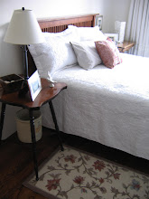
This room is as tiny as a Paris hotel room, so I had previously placed the bed against the wall (where the mirror is), but it looks good centered on the window, and leaves space for a small bedside table on each side.  But there is now less room to walk around:
I have temporary bedside tables but plan to get new ones.  I'd prefer antiques, but I have searched every antique store in Calgary and area and cannot find one I like (let alone a pair).  I am growing impatient (never my strong suit).  I like this affordable option from Pottery Barn:
 I generally prefer wood-coloured (brown) furniture as it's more classic.  David prefers the brown too, but for this room, I think the white would be prettiest.  What do you think?  With new knobs, I think this piece would be quite pretty.  I like the drawer (to hide away things) and the shelf (for holding magazines)! 
*
I still have to figure out what to do about that window and ledge!  The centered arrangement would allow me to put drapes around the window, making a sort of canopy around the bed (although the ledge is problematic).  But that option feels a little overdone to me.  I am not a canopy/wall-o-drapery type of person.  So I am considering options and hoping for a lightening bolt to strike!  Fabric is a must, whether I do a simple Roman shade or a valance.
*
In the meantime, our new St.Geneve Canadian duvet (a Christmas gift from Mom) arrived!  This duvet is the real deal, made of 100% Canadian goose down (no feathers), 100% hypoallergenic, and guaranteed for 20 years!  I purchased the Lajord Light option, which is 800 loft and it so lightweight:
The duvet cover, also from St-Geneve, has not yet arrived but I may try the duvet tonight to see how warm it is!

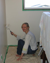
Trim work will be painted white as soon as I'm up to it.  I've had terrible headaches and back pain lately and haven't been good for much, but I am planning!

Here is the view from inside the room:

After the trim is painted, I will choose a new light fixture and hardware for the closets!  I am torn between a pretty chandelier and a simple lantern: 
I like this very affordable chandelier from Shades of Light

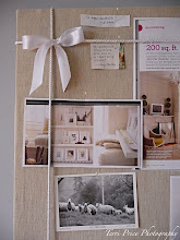
Oh, and art!  I can't wait to put up some pretty new prints, which I hope to frame myself.  

P.S.  If you missed my previous post, I started a picture framing class at a local art school.  Last night we learned how to hand-cut mats and next week we learn how to cut mats using a mat cutting apparatus and also to cut glass!  I will post soon about my framing adventures!
*
Now for your feedback, do you think I should use white or brown wood side tables?