Some new things arrived at our house this week. Apparently
simply stopping shopping is not happening here (though I do try).
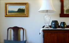
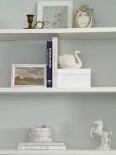
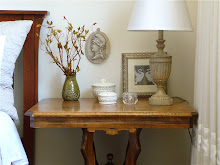
Today I attended a wonderful pottery market. I bought the two black pieces in the background (on the right), which look very similar but are by two different artists. The large pot is by Ezequiel Morales, a Calgary-based potter originally from Mexico. I love his work, which often has a clean, Japanese feel to it. The black pot in the background, far right, is by Ardin Howard, whose work is also very fine:

The large bowl (white interior) in the foreground above is also by Ezequiel and was already in my collection.
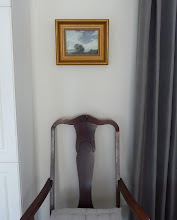
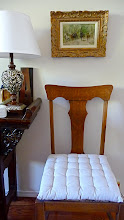
The pottery came out of storage because I am now celebrating the arrival of this painting, our landscape acquisition by American painter Al Barker. It arrived this week to great fanfare:

The painting is beautiful - very moody and quite dark, so the pottery came out to complement it colour-wise. I have not decided where the painting will hang as I think it needs more light...perhaps near the front door. The frame is heavy and ornate and I love its volume but the very gold colour is standing out like a sore thumb from my otherwise sedate, silvery decor. Hence the black pottery to balance it until I figure out how to integrate it...
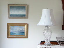
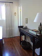
Below, the shiny pot in the foreground (right) is by New Brunswick potter
Tom Smith (originally American) who is really rather famous (and fascinating). I bought it this summer on holiday, in St.Andrew's N.B. where he resides and has a studio. He does all raku work:

Tom sold me my first pottery vase 20 years ago (a gift from my mother while I was in university). I loved it so, but sadly knocked it off a ledge in my first Toronto apartment, straight down into the long stairwell that came up into my loft. I still have all the pieces and told Tom I was going to glue it back together some day!
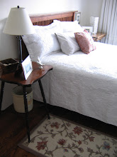
I think they all look nice together:
I am a major convert to fine china, but the pottery (my first love) still comes out from time to time.
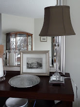
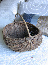
I also purchased this piece (below) at the sale today, which is similar to two other pieces I own from yet a different potter. This is by Ardin Howard also. Its curves suit my living room, which is full of curvilinear furniture (and mirrors the adjacent lucite lamp base):

When I buy pottery, I try to buy either blue-black or slate blue-green so they all complement each other and look like a proper collection.
Hope you've enjoyed the visit.
By the way, do you like my new blog banner? I thought it was time for a little update.


